We Tested the Best GPT Image 2.5 Use Cases: 10 Prompts You Can Copy and the Images They Made!
Sponsored
Sponsored
Key Takeaways
- 10 GPT Image 2.5 use cases, with the exact prompts. Copy any prompt below, paste it into ChatGPT, and you should get something close to what you see here. Every image on this page is a raw output, uncropped and untouched.
- The wins are in structure, not spectacle. Readable labels, consistent characters, aligned layouts, and edits that hold up over several rounds. That is what changed.
- Flare and Sunburst are API names only. Inside ChatGPT there is no variant to pick, so ignore the toggle you have been told to look for.
- A full three round revision cycle held together. We took one poster through a colour change and then a structural change, and the typography, texture and margins survived all of it. That test is the most useful thing in this article.
- Multi turn editing is the real unlock. Five of these ten are multi step, where each step edits the image the last one produced.
10 GPT Image 2.5 Use Cases We Tested, With the Exact Prompts
Most model launch articles show you a gallery and leave you guessing at how it was made. We wanted the opposite. So we picked ten GPT Image 2.5 use cases that actually come up in client work, wrote a prompt for each one, ran them in ChatGPT, and put the prompt and the result side by side. Nothing here is cherry picked from a hundred attempts. Each prompt got one regeneration at most, and where a result fell short of what we asked for we kept it and said so.
Every image is 16:9 and sized exactly as ChatGPT returned it, 1672 by 941 pixels.
What Is GPT Image 2.5?
GPT Image 2.5 is OpenAI’s image model, released on September 8, 2026 as ChatGPT Images 2.5. It went live across the ChatGPT, ChatGPT Work, and Codex tiers, and shipped alongside a sketch drawing tool, comment based editing where you leave a note on a region of the image, and output up to 4K.
In the API it comes in two flavours, gpt-image-2.5-flare and gpt-image-2.5-sunburst. Flare is the default for most work and runs at roughly half the latency of the previous model. Sunburst is aimed at premium jobs that need tighter control across a run of successive edits, like campaign creative or finished product imagery. Worth being clear, because plenty of coverage has muddled this: those two names only exist in the API. If you are working inside ChatGPT, as we were for this article, there is no variant switch to find.
About These Prompts
Copy them. That is the point of the article. A few things worth knowing before you do.
- Start a new chat for each one. Old context leaks into new images more than you would expect.
- Where a use case has a step two, send it as the next message in the same chat. That is what makes it an edit rather than a fresh generation, and the whole test is whether the model holds onto what it already made.
- Be specific about the boring parts. Gutter widths, label wording, which arm the shield is on. The model rewards it now in a way it did not before.
- Expect embellishment. Several results added small details nobody asked for. Useful in a mockup, annoying in a spec.
1. Consistent Character Sheets
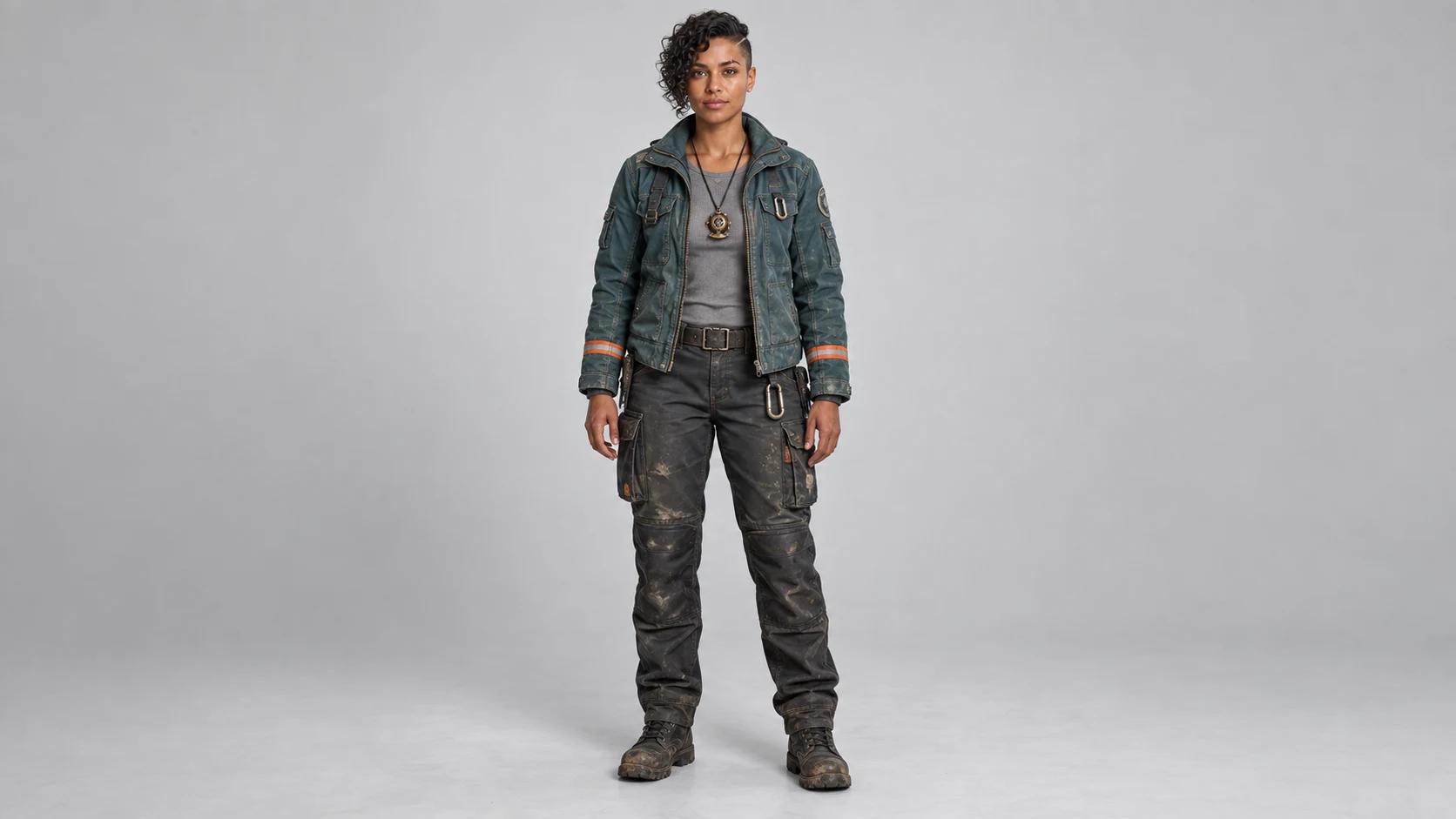
The oldest complaint about AI image tools is that your character changes face between shots. This is a two step test: build a character, then ask for six views of that same person.
A 16:9 landscape full body character portrait of a 30 year old woman named Rhea, a deep sea salvage engineer. She stands centred in the wide frame with clean empty space either side of her. Close cropped dark curly hair with a shaved left side, a faded scar through her right eyebrow, warm brown skin, hazel eyes. She wears a scuffed teal canvas work jacket with orange reflective piping on the cuffs, a grey thermal underlayer, and a brass diving pendant on a leather cord. Neutral standing pose, arms relaxed at her sides, facing the camera. Plain light grey studio background, soft even three point lighting, sharp focus, photorealistic, her whole body inside the frame with headroom above and below.
Using the exact same character, build a 16:9 landscape character sheet on a plain light grey background: three columns across by two rows down, six panels total, thin white gutters between them. Panel 1 front view neutral. Panel 2 left profile. Panel 3 three quarter turn to the right. Panel 4 back view. Panel 5 crouching and reaching forward with her right hand. Panel 6 shoulders up close portrait, laughing. Keep her face, scar, hair, jacket, piping and pendant identical in every panel. Same lighting and same colour grade across all six. No text, no labels, no borders around the outside.
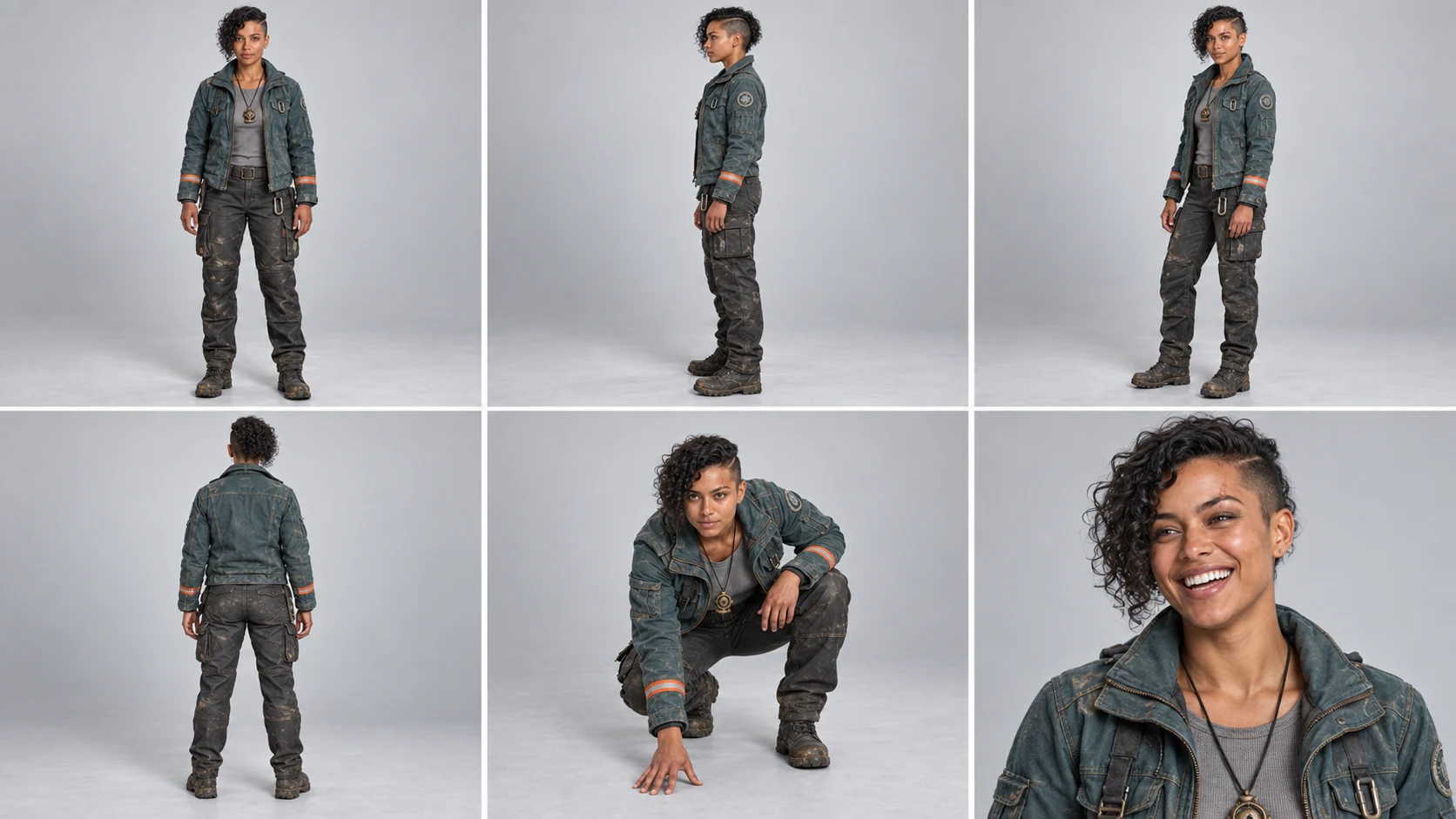
What to notice: the shaved side stays on her left in all six panels, including the back view, where a weaker model usually flips it. The orange cuff stripes, the pendant, and the wear on the trousers carry across the crouch and the close up. The scar is the weak point. It reads clearly in panel 6 and is barely there in the wide shots, which is a resolution limit more than a consistency one.
2. Multi Turn Design Iteration
This is the most useful test in the article. One poster, then two separate rounds of edits, the way a real revision cycle actually goes. First a full colour change, then a structural change. Every version below is the model editing its own previous image.
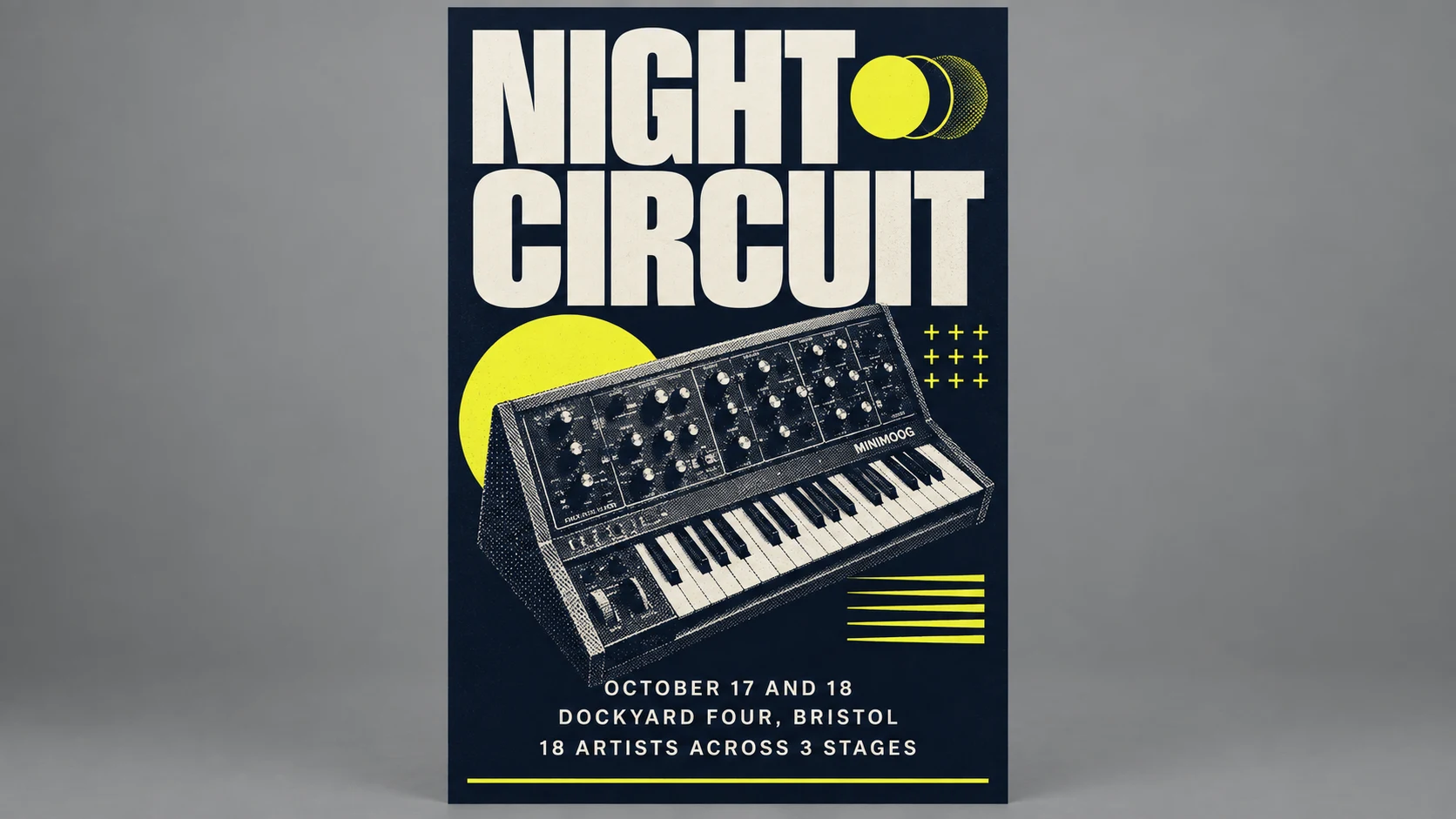
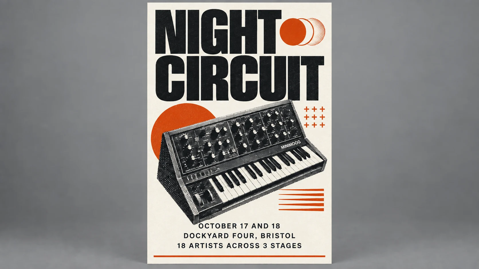
A 16:9 landscape image of a vertical 2:3 event poster presented flat and straight on, centred in the frame against a seamless mid grey studio backdrop with soft even lighting and generous empty space on both sides. The poster itself: a bold modern editorial layout for a music festival called NIGHT CIRCUIT. Deep navy background, a single large halftone photograph of a synthesizer at a 20 degree angle in the centre, acid yellow accent shapes. Title NIGHT CIRCUIT set very large in a heavy condensed sans serif across the top two lines. Below the image, three lines of smaller text: "OCTOBER 17 AND 18", "DOCKYARD FOUR, BRISTOL", "18 ARTISTS ACROSS 3 STAGES". A thin yellow rule above the bottom edge. Clean generous margins, all text crisp and readable, print quality. The poster fills the full height of the frame.
Keep the 16:9 frame, the grey backdrop, the poster position, the layout and the typography exactly as they are. Change the poster's colour scheme only: swap the deep navy for a warm off white, the acid yellow for a deep burnt orange, and make all the text near black.
Same poster, same colours, same 16:9 frame. Now move the synthesizer photograph down so it sits between the title block and the text block, shrink it by about 20 percent, and add a fourth line of small text under the other three reading "TICKETS AT NIGHTCIRCUIT.LIVE". Do not change anything else.
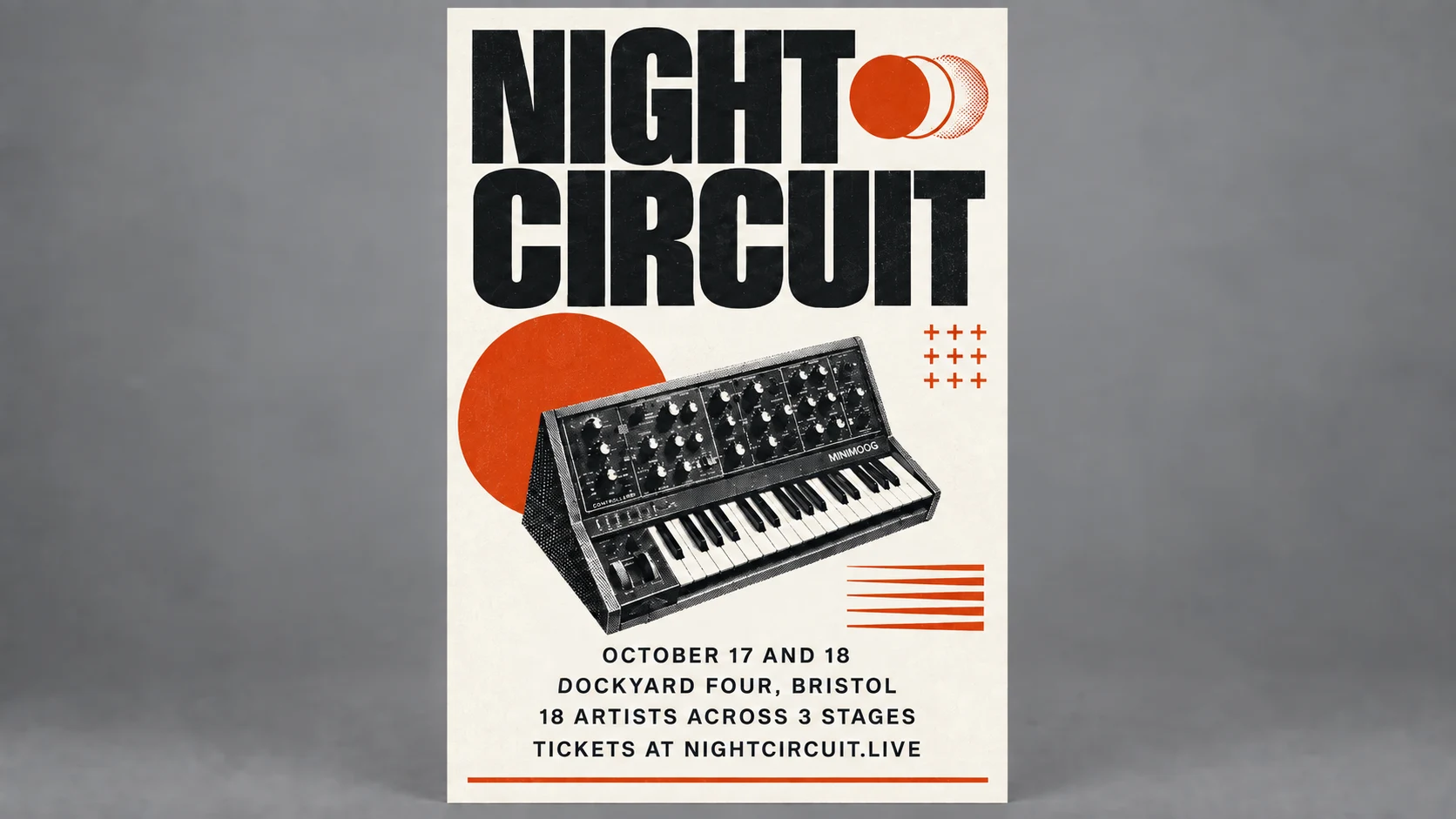
What to notice: step two is flawless. The palette flips completely while the condensed title, the halftone dot texture on the synth, the margins, and the line breaks all survive untouched. Step three is the harder ask, because it is three instructions at once and two of them are structural. It landed all three. The synth moved down into the gap between the title and the text, it shrank by roughly the amount we asked for, which you can see in how much more of the orange circle is now visible behind it, and TICKETS AT NIGHTCIRCUIT.LIVE appears as a fourth line set in the same face and spacing as the three above it. Three turns deep, the typography, the halftone texture and the margins are still exactly where they started. That is the single best argument in this article for working in steps instead of writing one enormous prompt.
3. Text Dense Infographics
Garbled text was the signature failure of AI image generation. Four numbered labels, a legend, and a footnote is a fair way to find out whether that is over.
A clean educational infographic, 16:9 landscape, on an off white background. Title across the top reading "HOW A HEAT PUMP MOVES HEAT". Centre of the frame, a simple flat vector cutaway of a house with an outdoor heat pump unit on the left wall and an indoor air handler on the right. A continuous loop of refrigerant piping runs between them with four labelled stages placed on the loop: "1. EVAPORATOR, refrigerant absorbs outdoor heat", "2. COMPRESSOR, pressure and temperature rise", "3. CONDENSER, heat released indoors", "4. EXPANSION VALVE, pressure drops". Cold side of the loop in blue, hot side in orange, arrows showing direction of flow. Small legend in the bottom left with two swatches reading "COLD REFRIGERANT" and "HOT REFRIGERANT". A single line of footnote text along the bottom edge reading "Efficiency falls as the outdoor temperature drops". Use the full width of the wide frame, do not crowd everything into a narrow centre column. Flat vector style, limited palette of blue, orange, charcoal and off white, every word spelled correctly and clearly legible.
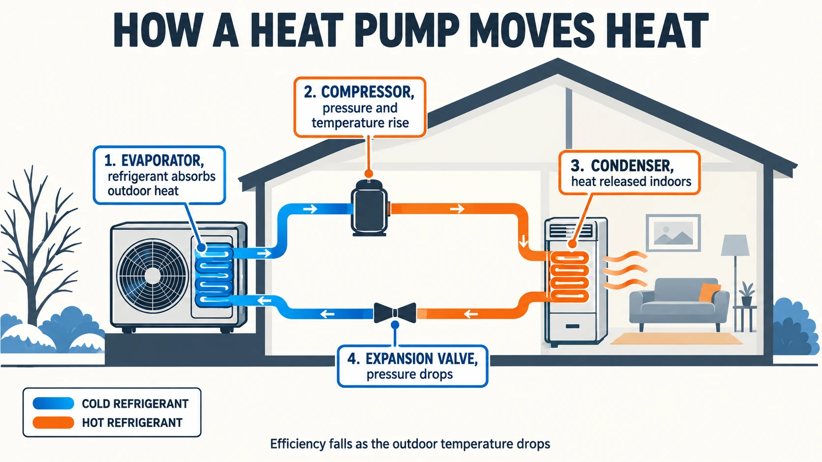
What to notice: every word is spelled correctly. All four numbered labels, both legend swatches, the title, and the footnote. Then look past the text, because the better result is that the diagram is actually right. Cold blue refrigerant runs into the outdoor evaporator, leaves the compressor hot and orange, releases heat at the indoor condenser, and drops pressure at the expansion valve before going round again. It understood the system, it did not just place the words we gave it.
Sponsored
4. Complex UI Mockups
Interface mockups punish a model for sloppiness, because humans spot a misaligned card instantly.
A flat UI design mockup of a desktop dashboard for a bike courier company called PEDALWORKS, 16:9 landscape, shown as a clean flat screen image filling the whole frame with no browser chrome and no device frame. Left sidebar 220px wide in dark charcoal with the PEDALWORKS wordmark at the top and six nav items reading "Overview", "Live Map", "Riders", "Jobs", "Invoices", "Settings", with "Live Map" highlighted. Main area on a light grey background. Top row, four equal stat cards reading "ACTIVE RIDERS 24", "JOBS IN FLIGHT 61", "AVG PICKUP 7m 12s", "ON TIME 94%". Below that, a wide card two thirds width titled "Deliveries per hour" containing a simple line chart with an x axis labelled 06:00 through 20:00. To its right, a one third width card titled "Rider leaderboard" with five rows, each row a small avatar circle, a name, and a number. Consistent 24px gutters, consistent card corner radius, one accent colour of lime green used only on the highlighted nav item and the chart line. Crisp legible type at every size.
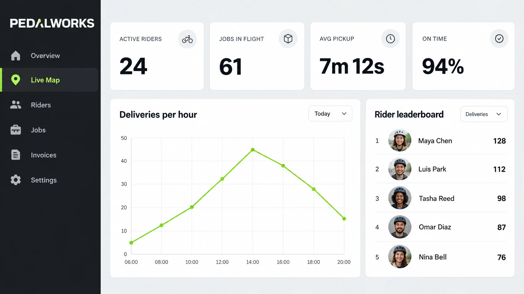
What to notice: the four stat cards are genuinely equal width and the gutters are genuinely even. The x axis runs 06:00 to 20:00 in the right order, every nav item is spelled correctly, Live Map is the highlighted one, and the lime accent stays where it was told to stay. It also invented things nobody asked for: a Today filter dropdown, icons in each stat card, photographic avatars, and a second dropdown on the leaderboard. For a client mockup that is a bonus. If you are generating a spec, know that it fills gaps on its own.
5. Transparent Background Isolation
A subject with fine hair, thin antennae, and translucent wing panels is the hardest thing to cut out cleanly. Asking the model to generate it already isolated skips the cutout entirely.
A 16:9 landscape image, transparent background. A single Atlas moth with its wings fully spread, seen from directly above, centred in the wide frame, photorealistic macro detail, every scale and the fine hair on the body visible, the delicate translucent triangular windows on the upper wings clearly rendered. Transparent background, no shadow, no backdrop, no ground plane. The wingspan runs across the width of the frame with an even margin on all sides. Export with a transparent background as a PNG.
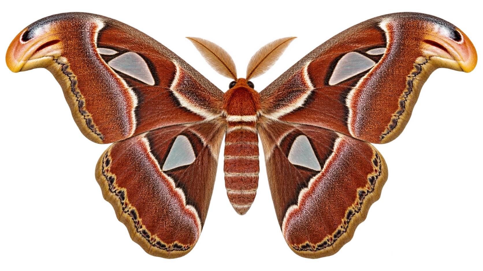
What to notice: we pulled this one apart in an image editor rather than trusting our eyes. The alpha channel is real, the antennae keep their feathered edges, and the semi transparent edge pixels carry the moth’s own brown rather than a white halo, which is exactly where cheap background removal gives itself away. One technical quirk: the body sits at an alpha of 251 to 254 rather than a true 255, so the subject is fractionally translucent everywhere. Invisible on a plain background, faintly ghosted over a busy one. A levels adjustment on the alpha channel clamps it in seconds.
6. Product Staging on a Real Location
Shoot the product once on white, then put it anywhere. This only counts as a win if the lighting gets rebuilt for the new scene rather than pasted over it.
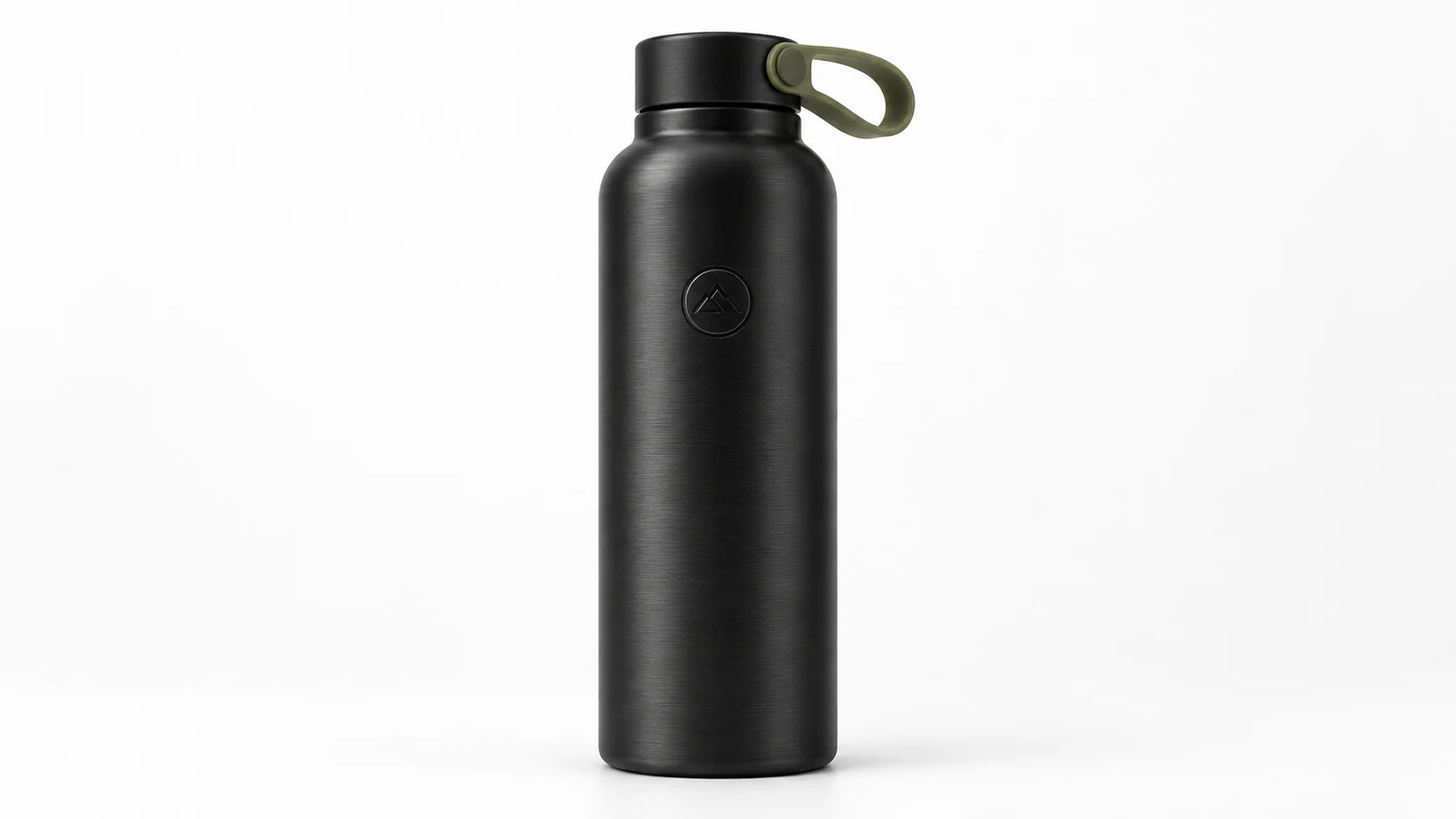
A 16:9 landscape product photograph of a matte black stainless steel insulated water bottle, 750ml, straight sided with a subtle brushed texture, a small embossed circular logo mark on the front, and a matte olive silicone loop on the lid. The bottle stands centred in the wide frame with clean empty space either side of it. Shot straight on at eye level, on a plain seamless white background, soft large softbox from the upper left, gentle contact shadow directly beneath. Commercial product photography, extremely sharp, no text on the bottle.
Keep this exact bottle, the same shape, the same proportions, the same matte finish, the same logo mark and the same olive lid loop, and keep the 16:9 landscape frame. Restage it on a wet dark slate rock beside a mountain stream at golden hour, the bottle still centred with the landscape opening up either side of it. Low sun coming from the right, warm rim light down the right edge of the bottle, cool bounce light on the left, a realistic wet contact shadow and a faint reflection on the slate. Shallow depth of field with the background falling soft. Do not change the bottle itself in any way.
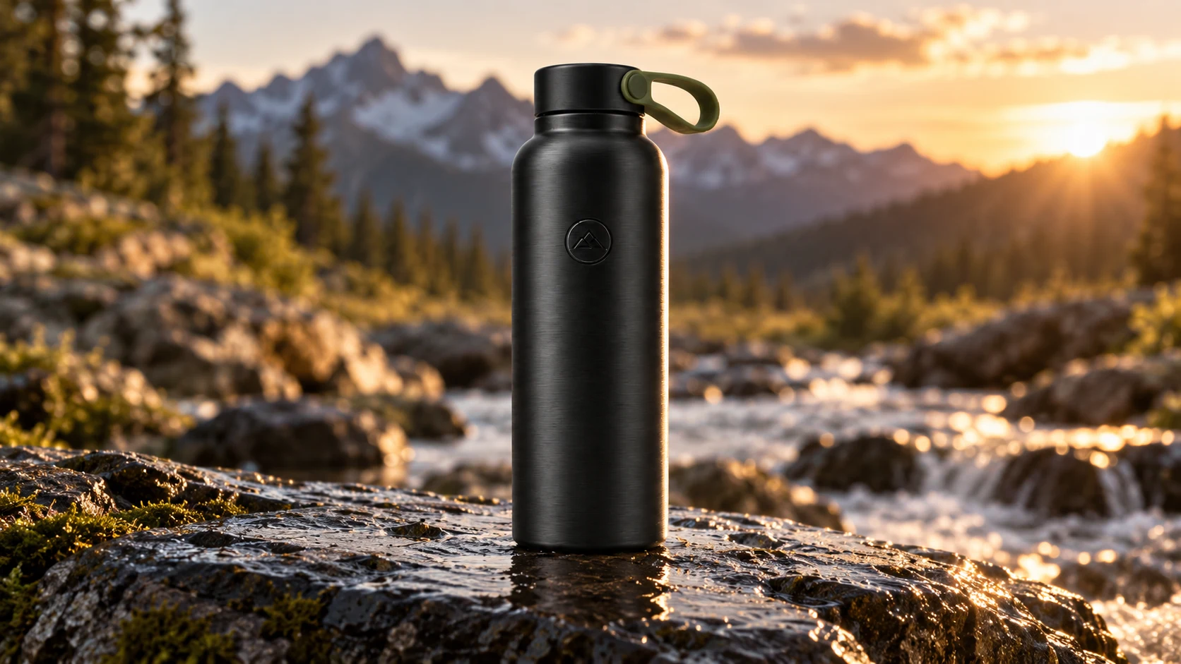
What to notice: the embossed mountain logo, the olive loop, and the brushed texture are identical between the two shots. The important part is the light. The studio version is lit softly from the upper left. The staged version has a hard warm rim running down the right edge, because that is where the sun is in the new scene, with cool fill on the left and a wet reflection under the base. It relit the object instead of compositing it. This is the use case most likely to save an e commerce team real money.
Sponsored
7. Game Asset Sprite Sheets
Eight frames of one character, all needing the same proportions, the same palette, and the same pixel scale.
A pixel art sprite sheet, 16:9 landscape, on a flat dark grey background, four columns by two rows filling the frame, eight frames of a single run cycle, thin darker grid lines separating the cells. The character is a small armoured fox knight, rust orange fur, a dented steel breastplate, a short green cape, and a wooden shield strapped to the left arm, facing right in every frame. Frames progress through a full run cycle, contact, down, pass, up, and repeat, with the cape and the tail trailing naturally. Identical character design, identical palette and identical pixel scale in every frame, crisp hard pixel edges, no anti aliasing, no text, no frame numbers.
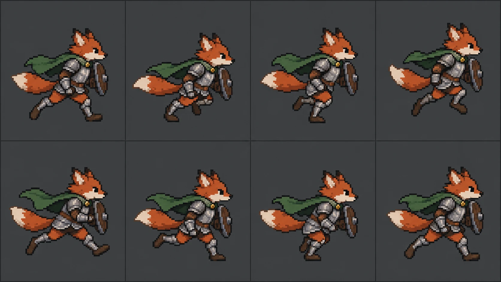
What to notice: the character survives all eight cells. Same rust fur, same dented breastplate, same green cape, and the shield stays strapped to the far arm in every frame rather than hopping sides. Be honest about the limits though. Several frames are near duplicates of each other, so this does not read as a clean four phase run cycle, and the sprite sits at a slightly different position and scale from cell to cell, which would jitter if you dropped it straight into an engine. Treat it as a concept sheet an artist redraws on top of, not a shippable sprite sheet.
8. Blueprint to Photoreal Render
Draw a floor plan, then ask the model to stand inside it and take a photo. This is the test with the most obvious commercial value and the most ways to go wrong.
A clean black and white architectural floor plan drawing, 16:9 landscape, top down, of a small single storey two bedroom house, drawn as a technical line drawing on white and filling the wide frame. Thick walls, door swing arcs, window breaks in the walls. Layout, reading left to right: a bedroom 4m by 3.5m in the top left, a second bedroom 3.5m by 3m below it, a bathroom 2.5m by 2m between them on the left wall, and one open plan living, kitchen and dining space 8m by 5m running down the entire right hand side with a kitchen counter run along the top right wall, an island, and a wide sliding glass door on the far right wall opening to a terrace. Room names labelled in small clean uppercase type, dimension lines along the outer edges. No colour, no furniture shading, no title block.
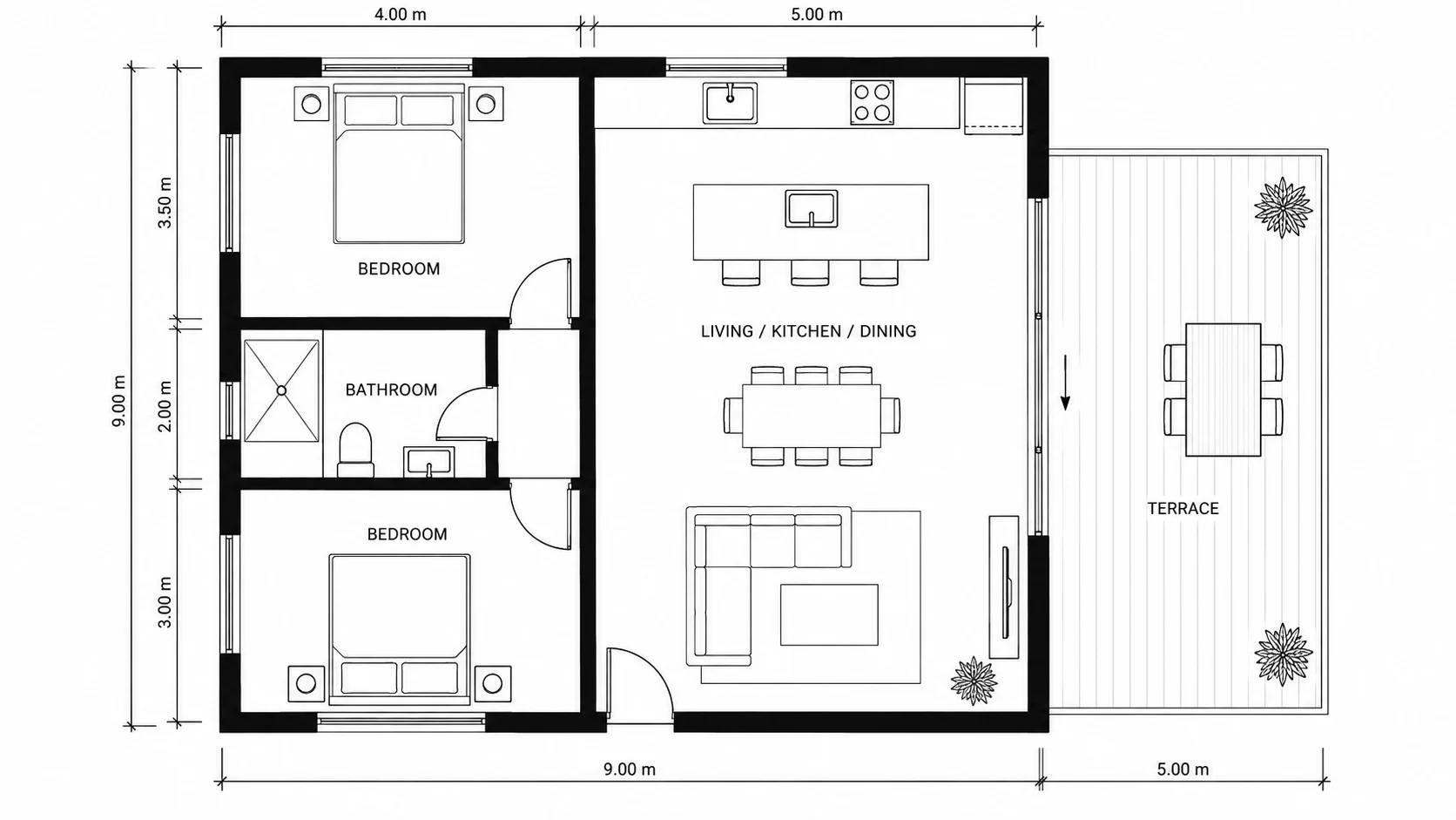
Render the open plan living, kitchen and dining space from this exact floor plan as a photorealistic 16:9 landscape interior photograph. Camera stands in the doorway at the top of that space looking toward the sliding glass door, at eye level, 24mm lens. Keep the wall positions, the room proportions, the kitchen counter run along the right wall, the island, and the sliding door exactly where the plan puts them. Warm oak floors, white walls, a pale plaster ceiling, a concrete island top, mid afternoon daylight flooding in through the sliding door, soft realistic shadows. Furnished simply with a low linen sofa, a round timber dining table with four chairs, and one large potted olive tree.
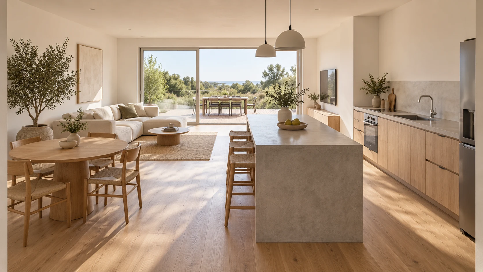
What to notice: the render genuinely obeys the plan. The kitchen counter run is on the right, the island sits where the plan drew it, the sliding door closes the far end, and the terrace beyond it even has the outdoor dining set the plan put there. Two honest deviations, both in step one: the plan drew the living space narrower than the 8m by 5m we specified, and it furnished every room despite being asked for a bare technical drawing. So it reads the plan faithfully. It just does not follow a spec to the letter when drawing one.
9. Moodboard to Finished Room
Nine material and lighting references, then a room that has to use all of them. The failure mode here is a generically warm room that ignores the actual swatches.
An interior design moodboard collage, 16:9 landscape, on a white background, arranged as a neat grid of nine tiles across three columns and three rows, wider than they are tall, with thin white gutters, filling the frame. Tile contents: a close up of ribbed vertical oak panelling, a swatch of deep forest green boucle fabric, a swatch of unlacquered brass, a close up of cream travertine stone, a photograph of a single arched floor lamp with a linen shade, a photograph of a low curved sofa in cream, a close up of a rust coloured wool rug texture, a photograph of a large fiddle leaf fig in a terracotta pot, and a warm evening lighting reference showing a pool of lamplight on a wall. Cohesive warm palette of oak, forest green, brass, cream and rust. No text, no labels.
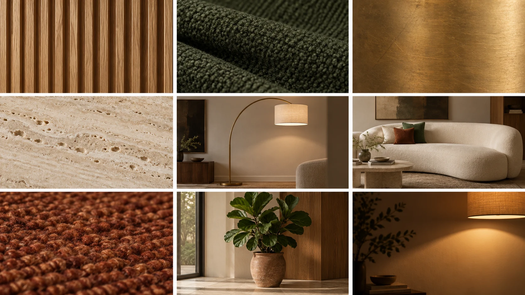
Using only the materials, the colours and the lighting mood from this moodboard, generate a photorealistic 16:9 landscape wide interior photograph of a living room that uses all nine of them. Ribbed oak panelling on the back wall, the curved cream sofa centred against it, the forest green boucle on two accent chairs, unlacquered brass on the lamp and the hardware, a travertine coffee table, the rust wool rug underneath, the fiddle leaf fig in its terracotta pot in the right corner, and the arched floor lamp behind the sofa casting that same warm pool of light. Evening, lamps only, no daylight. 35mm lens at eye level, realistic materials and reflections.
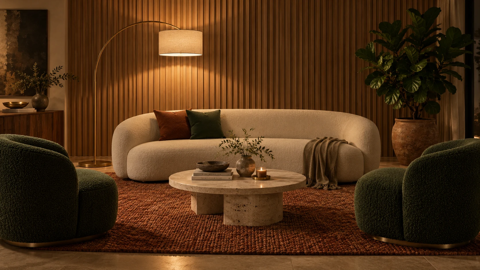
What to notice: this was the strongest result of the ten. All nine references made it across, and not loosely. The oak panelling has the same rib spacing as the swatch, the boucle on the chairs is the same forest green, the travertine table matches the stone tile, and the arched brass lamp throws the same pool of light as the lighting reference. It even carried over the dark artwork and the timber sideboard that only appeared incidentally inside two of the moodboard photographs. For anyone who pitches concepts to clients, this two step move is the whole workflow.
Sponsored
10. Packaging and Pattern Application
Wrapping artwork around a curved surface is where most generators betray themselves. The pattern sits on the bottle like a flat sticker instead of bending around it.
A 16:9 landscape product photograph of a tall cylindrical kombucha bottle, 500ml, clear glass with amber liquid inside, standing centred on a pale concrete surface against a soft neutral backdrop with clean empty space either side of it, studio lit from the upper left with a large soft source. The full height wraparound label carries a dense repeating botanical pattern of interlocking ginger roots, turmeric slices and small five petalled flowers in terracotta, sage green and cream. The pattern must wrap correctly around the curve of the bottle, compressing and turning at both edges where the surface falls away, with the studio highlight running down the left side of the bottle passing over the pattern and the shadow side darkening it. Across the middle of the label, a clean horizontal band in cream with the words "WILD ROOT" in a confident serif and "GINGER AND TURMERIC" in small spaced out uppercase beneath it. Sharp commercial product photography, realistic glass refraction through the liquid.
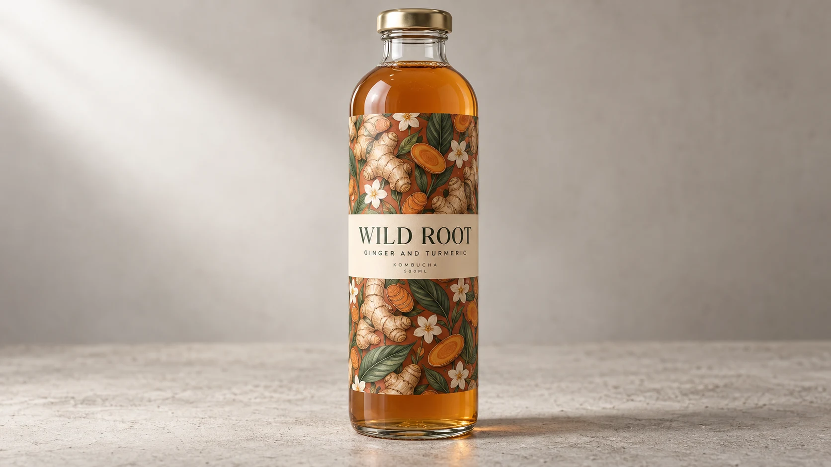
What to notice: the botanical pattern compresses and turns at both edges of the cylinder exactly as printed artwork does, and the soft highlight from the upper left runs down over the label rather than stopping at it. The type is clean, the serif is consistent, and the glass refracts the amber liquid properly behind the label edges. It also added KOMBUCHA and 500ML lines we never asked for, which is that same gap filling habit showing up again.
Why These GPT Image 2.5 Use Cases Matter
Ten prompts, sixteen images, one long revision chain. Put it together and the story is not that the pictures got prettier.
- Instruction following is the upgrade. Equal gutters, correctly spelled labels, a shield on the correct arm. Boring things, and they are what make an image usable in production.
- Step two is where the value is. Five of these ten use cases only work because the second prompt edits the first image. If you are still writing one giant prompt and hoping, you are using it wrong.
- It understands the subject, not just the words. The heat pump diagram is thermodynamically correct. The relit bottle has the sun in the right place.
- It fills gaps on its own. Dropdowns, icons, extra label lines. Helpful in a mockup, a problem when you need exactly what you specified.
- Edit chains hold three turns deep. Our poster took a full colour change and then a structural change without the typography or margins drifting. Still check every turn, but the drift problem is largely gone.
The honest caveat is resolution. ChatGPT handed us 1672 by 941 every time, which is fine for the web and short of print, so anything client facing needs an upscale. That is the same curve we watched play out with AI video models and again with GPT-6 Astra. The ceiling moves fast.
Flare or Sunburst, Which One Should You Use?
Only relevant if you are building on the API, since ChatGPT makes this choice for you. Flare is the default and the right answer most of the time: it beats the previous model on quality while running at roughly half the latency, which matters when you are generating in volume. Sunburst earns its keep on hero assets and long edit chains, the campaign image that goes through six rounds of client notes. Both carry the same published token rates, 8 dollars per million image input tokens and 30 dollars per million image output tokens, which is double what GPT-Image-2 cost. Pick Flare for exploration, move to Sunburst when the file has to survive revisions.
What We Use at JZ Creates
If these GPT Image 2.5 use cases have you wanting to build something, here is part of the stack we lean on day to day. We generate motion with Kling, cut fast in CapCut, voice everything with ElevenLabs, pull music and stock from Envato Elements, and wire the pipeline together with n8n. More on how that fits together in our breakdown of AI agents for business and our look at video with 3D.
How JZ Creates Can Help
Are you a brand looking at this and wondering who turns it into a campaign? We produce AI image, video, and interactive work for social and digital, and we build the automation behind it so it actually ships every week. Explore our AI creative services, browse more breakdowns on our blog, or contact us today and let’s make something worth looking at.
Frequently Asked Questions
What are the best GPT Image 2.5 use cases?
The strongest GPT Image 2.5 use cases are the ones that need structure rather than spectacle: consistent character sheets, text heavy infographics and diagrams, UI mockups with real alignment, transparent background cutouts, product restaging with correct relighting, and two step workflows like a moodboard turned into a finished room or a floor plan turned into a photoreal render. All ten are above with the prompts we used.
What is the difference between Flare and Sunburst?
They are two API models. Flare is the faster default, delivering better quality than GPT-Image-2 at around half the latency, and suits high volume or exploratory work. Sunburst is built for premium jobs that need tighter control across successive edits, such as campaign creative and polished product imagery. Both share the same published token pricing. Inside ChatGPT there is no variant to choose, the app handles it for you.
Can GPT Image 2.5 make transparent background images?
Yes. Ask for a transparent background in the prompt and save the result as a PNG or WebP, the two formats that carry an alpha channel. Our moth test held up under inspection, with clean feathered antennae and no white halo on the edge pixels. One quirk we found: the subject sat at an alpha of 251 to 254 rather than a full 255, so it is very slightly translucent. Clamping the alpha in any editor fixes it.
How many rounds of editing can it handle?
We pushed a poster through three turns and it held. Turn two was a complete colour change, turn three asked for three things at once, move an element, shrink it, and add a new line of text, and it delivered all three. Across all of it the condensed title, the halftone texture, the margins and the line breaks never drifted. Visual drift across successive edits used to be the reason nobody built a real revision workflow on these models, and on this evidence that has largely been fixed. Still check each turn before you build on it.

About Jay Hernandez
Jay Hernandez is an award-winning Creative Director with 20+ years of driving standout campaigns for top brands. Based in Los Angeles, he blends deep creative expertise with cutting-edge AI tools to help businesses and marketing teams unlock bold, breakthrough ideas that deliver real impact. If you are ready to elevate your brand and turn big visions into unforgettable campaigns, connect with Jay and make it happen.
Share This Article
Sponsored