We Made 10 Real Ads With GPT Image 2.6: Prompts and Examples Included for Marketers!
Sponsored
Sponsored
Key Takeaways
- 10 GPT Image 2.6 examples built for advertising, with every prompt included. Print ads, a billboard, an email, a menu board, a brand sheet and two animated GIFs. Copy the prompts, swap in your own brand, and go.
- The headline feature is motion. GPT Image 2.6 makes animated GIFs, so a mascot can wave and a product can spin, straight from a prompt.
- Consistency is the real win for marketers. We took one e-bike campaign from a hero ad to a billboard to an Instagram story, and the product, the rider and the headline never drifted.
- It handles the small print. The Black Friday email came back with sale prices that are exactly 40 percent off, and every hex code on the brand sheet was right.
- It is not perfect. GIFs come out small, props jitter a little between frames, and the model loves to add copy and props you did not ask for. We show those misses too.
GPT Image 2.6 Examples That Look Like Real Ad Campaigns
Every image model launch comes with the same gallery: a cat in a spacesuit, a city at sunset, a portrait with perfect skin. Pretty, but nobody gets paid for that. We wanted to know something more useful. Can the new model make the stuff marketers actually ship every week? So we wrote ten ad briefs, ran them, and put together these GPT Image 2.6 examples with the exact prompt next to every result.
The briefs cover the whole marketing calendar: a luxury print ad, a brand mascot that moves, a product loop for social, a full campaign rolled out across three formats, a Black Friday email, a creator style ad, a restaurant special, an A/B test, a product edit and a brand identity board. All the brands are made up, so you can borrow the prompts without borrowing anyone’s logo.
What Is New in GPT Image 2.6?
OpenAI announced Images 2.6 on November 4, 2026. It is live in ChatGPT and Codex on every plan, on desktop, mobile and web, and in the API. It arrives less than two months after the 2.5 release we tested in our GPT Image 2.5 use cases article, and it is a focused update rather than a rebuild. Here is what changed:
- Speed. OpenAI says images generate 50 percent faster. In the API, the Flare model can return an image in as little as six seconds on low quality.
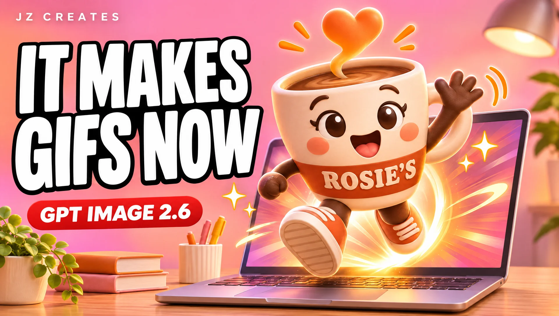
- Animated GIFs. The big one. You can animate a brand mascot, turn a product shot into a loop, or make reactions and memes for social, straight from a prompt.
- Consistency across edits. Characters, products and brand details stay the same as you revise, which is exactly what campaign work needs.
- Better layouts. OpenAI calls out posters, product imagery and other professional visuals as an area where Flare improved.
- New API controls. Image markup, which already lives in ChatGPT, comes to the API. Developers also get SVG export and a new complexity setting that controls how much planning the model does before it draws.
In the API there are two models, GPT Image 2.6 Flare and GPT Image 2.6 Sunburst. Flare is the fast one. Sunburst is the higher quality option with the strongest consistency across edits. Inside ChatGPT you do not pick between them, you just ask for an image. API pricing did not change from 2.5: $8 per million image input tokens and $30 per million image output tokens.
How We Made These Examples
We ran every prompt on GPT Image 2.6 Sunburst at high quality, 2K resolution, in 16:9 so the images work on the blog and in our video. Each image is the first result, with no cherry picking from dozens of tries and no retouching. Where a result missed part of the brief, we kept it and told you.
Three of the examples are follow up edits, where the model gets its own earlier image back and a new instruction. If you are working in ChatGPT, just send the follow up prompt in the same chat. For the product edit in example 9, we switched to ChatGPT itself so we could show the markup tool in action. The two GIFs used the native animated GIF output, and we also include the sprite sheet version for each one, since that is the format OpenAI uses in its own launch examples.
10 GPT Image 2.6 Examples for Advertising and Marketing
1. A Luxury Travel Print Ad
We started with the classic test for any image model: a magazine spread with a real headline, a real paragraph of body copy, a website and a wordmark. Body copy is where image models usually fall apart, because one wrong letter in a 20 word paragraph ruins the whole ad.
A 16:9 landscape double page magazine advertisement for a fictional luxury hotel brand called AURELLE, shown flat and straight on, filling the frame. Left page: a full bleed photograph of a quiet cliffside terrace above the Amalfi coast at golden hour, one white linen lounge chair, a glass of white wine on a small stone table, the sea far below. Right page: warm ivory background with generous margins. At the top, the headline in an elegant high contrast serif: "Stay Until the Light Changes." Under it, a short body paragraph in a refined small serif: "Twelve suites carved into the cliffs of Positano. No itinerary, no alarm, no reason to leave the terrace." Below that, a thin gold rule, then the line "Now booking spring 2027" and the website "aurelle.com". At the bottom right, a minimal AURELLE wordmark in spaced gold capitals. Print quality, every word crisp and correctly spelled, a natural paper texture, soft magazine gutter shadow down the centre.
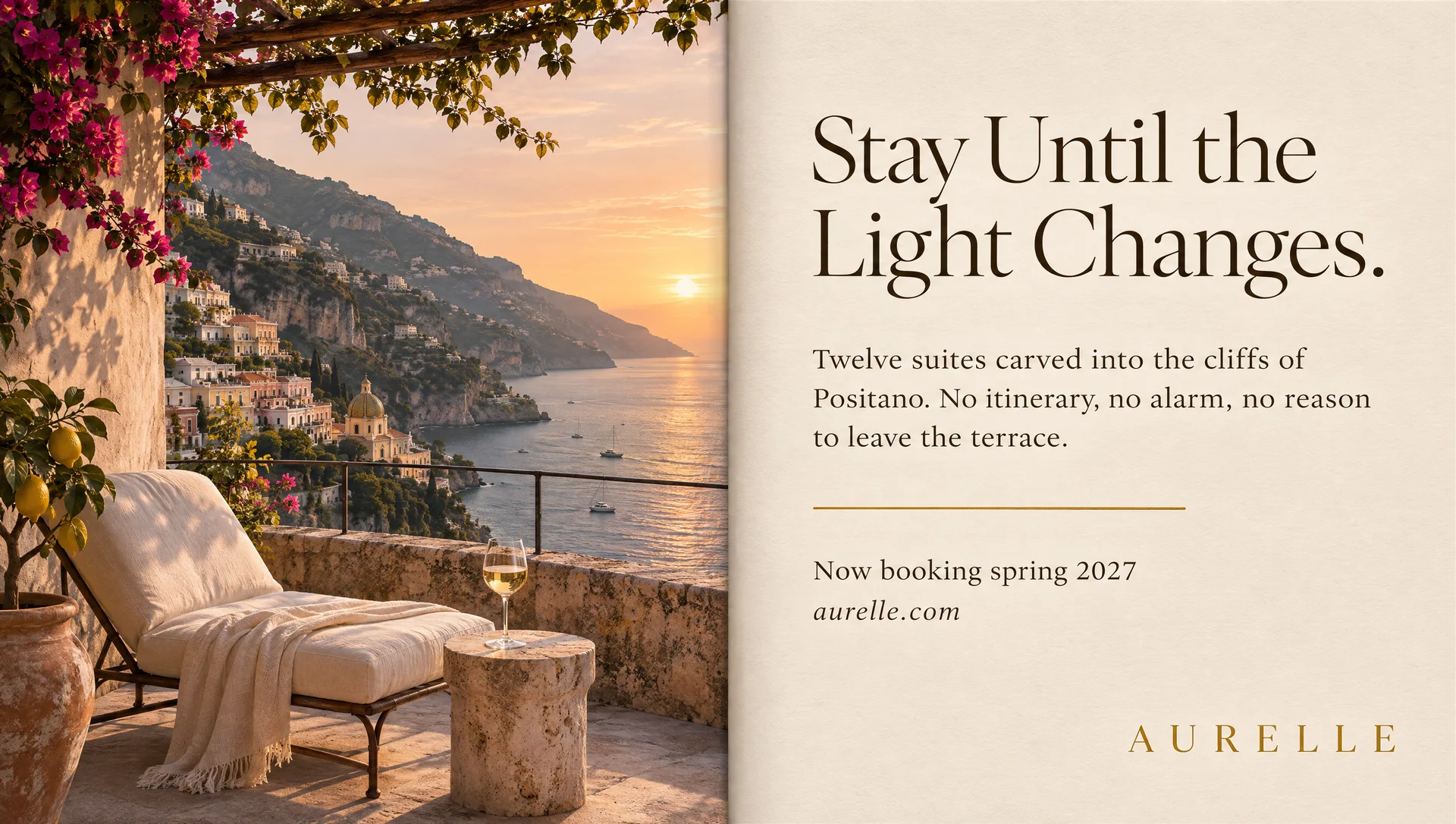
What to notice: Every word is correct, including the full body paragraph about the twelve suites in Positano. The hierarchy feels art directed: a big serif headline, smaller body, a thin gold rule, then the booking line and the spaced out AURELLE wordmark. The model also added a pergola, bougainvillea and a lemon tree that were not in the brief. They look great, but it is a reminder that it will happily decorate your scene for you. The page gutter we asked for is barely there, so it reads more like two panels than a bound magazine.
Who this is for: Hotels, travel brands and anyone pitching a print or digital magazine placement who wants to show a client a near final layout in the first meeting.
2. A Brand Mascot That Moves
This is the feature OpenAI led with, so we gave it a real brief: a coffee shop mascot that waves at the viewer, puffs its steam into a heart, and hops. For a GIF to loop, the character has to stay the same size and in the same spot from frame to frame, which is much harder than it sounds.
A seamless looping animated GIF, 16:9 landscape. The mascot for a fictional neighbourhood coffee brand called ROSIE'S ROAST: a cheerful round coffee cup character with a small orange flame shaped tuft of steam on its head, big friendly eyes, rosy cheeks, tiny arms and sneakers, a cream ceramic body with a terracotta band printed with the word ROSIE'S. The animation: standing and smiling, notices the viewer, waves enthusiastically with one arm, the steam tuft puffs up into a small heart, gives a happy little hop, then settles back into the start pose so the loop is seamless. Fixed front camera, same character, same scale and position throughout, plain warm cream background. Polished soft 3D toy style, warm morning lighting. The only text is ROSIE'S on the cup.
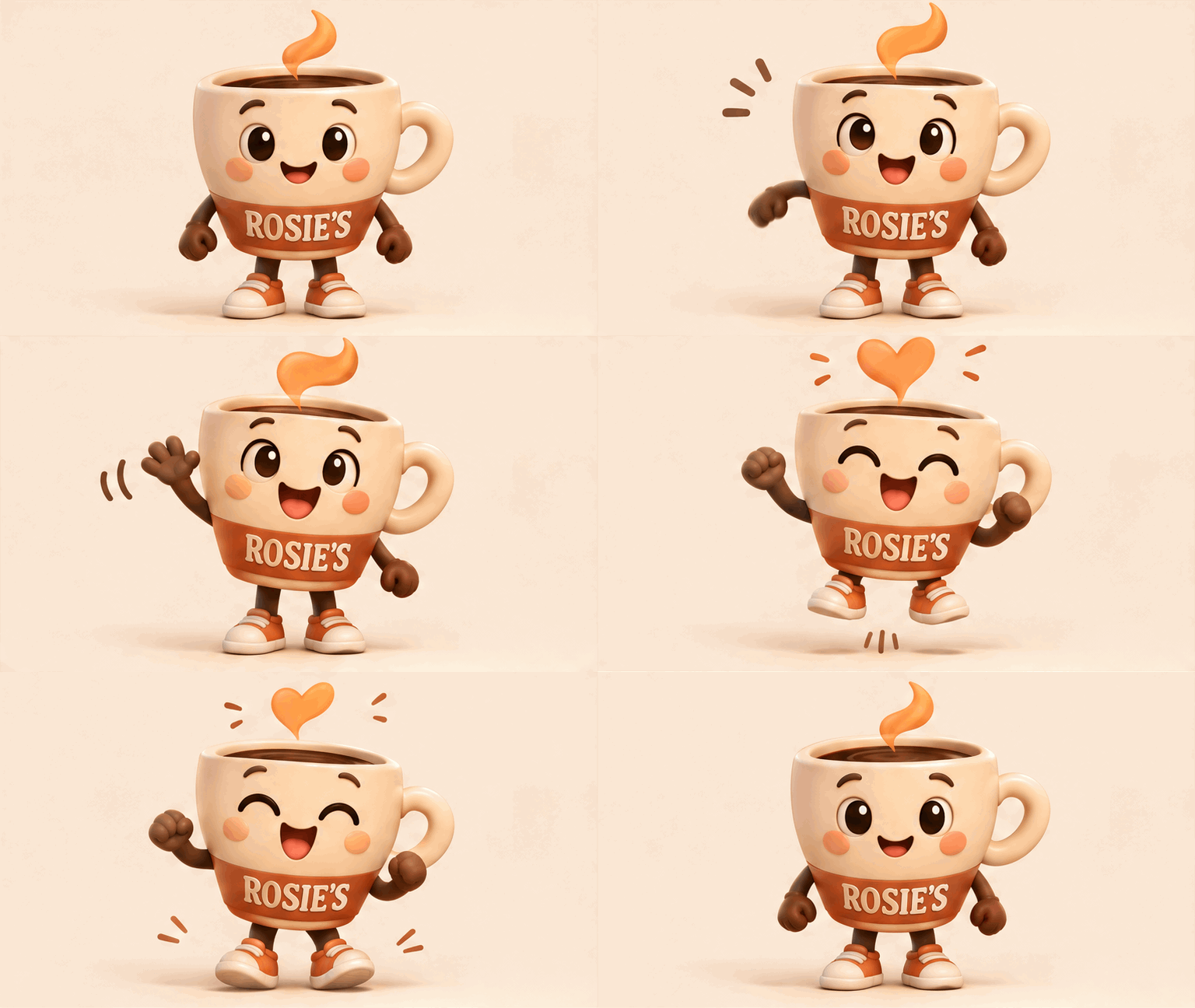
And here is the sprite sheet version. This is the same idea laid out as six frames in a grid, which is useful if you want to hand the frames to an animator or drop them into a game engine.
Create a single animation sprite sheet for a seamless looping GIF, 16:9 landscape overall. The character is the mascot for a fictional neighbourhood coffee brand called ROSIE'S ROAST: a cheerful round coffee cup character with a small orange flame shaped tuft of steam on its head, big friendly eyes, rosy cheeks, tiny arms and sneakers, a cream ceramic body with a terracotta band printed with the word ROSIE'S. The sequence: standing and smiling, notices the viewer, waves enthusiastically with one arm, steam tuft puffs up into a small heart, gives a happy little hop, settles back to the start pose. Exactly 6 sequential frames in a precise 3 column by 2 row grid, read left to right then top to bottom, every panel identical in size. Fixed front camera, same character, same scale, same position in every panel, plain warm cream background. Clear incremental motion, frame 6 flows smoothly back into frame 1. Polished soft 3D toy style, warm morning lighting. No captions, no panel numbers, no borders, no gutters, the only text is ROSIE'S on the cup.
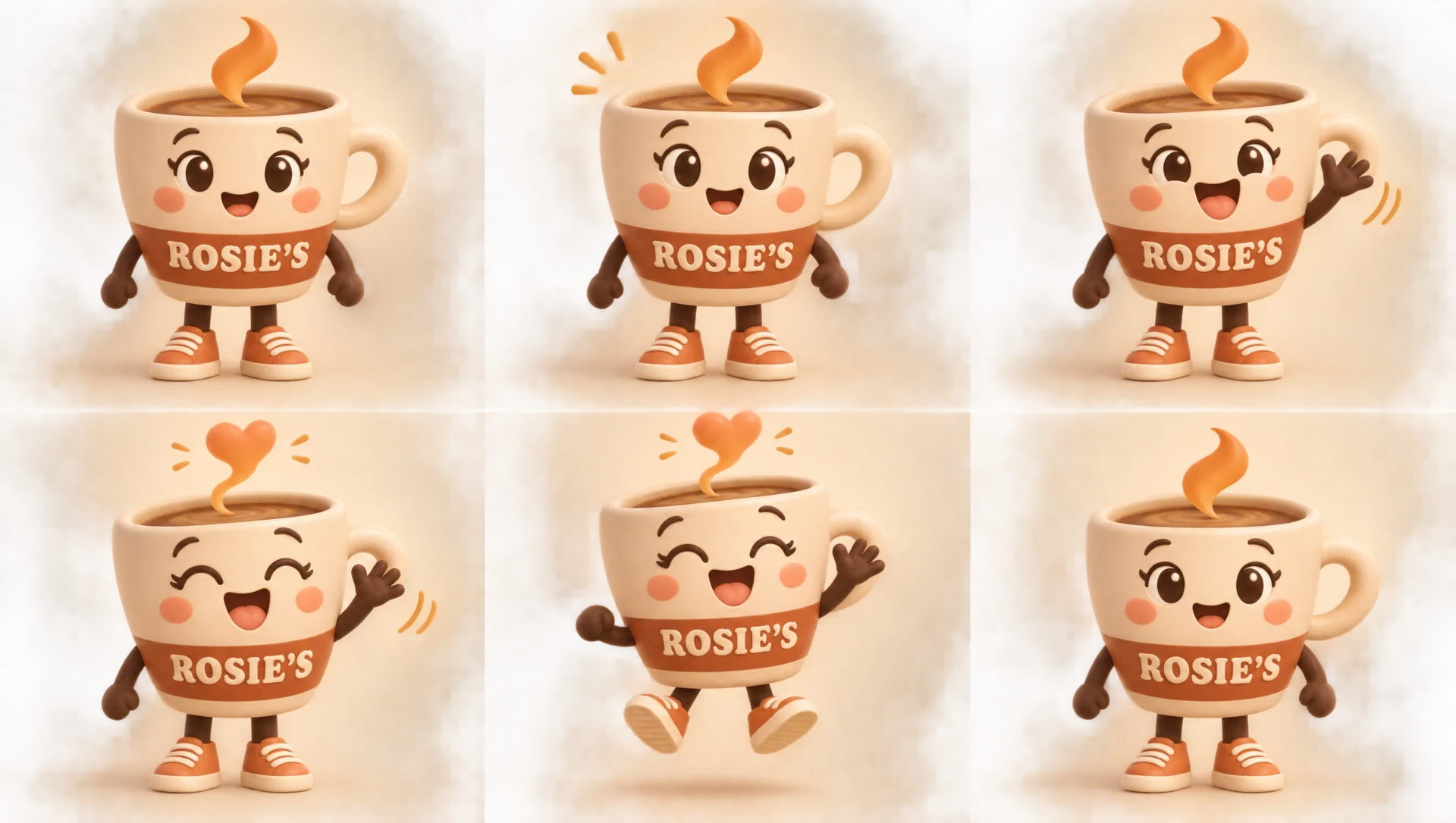
What to notice: The GIF runs twelve frames and it reads clearly: smile, notice you, wave, heart, hop, settle. The last frame matches the first, so the loop is smooth. ROSIE’S stays spelled the same on every frame, which is the detail that would get a mascot rejected by a brand team if it slipped. The character drifts sideways a little during the hop, and in the sprite sheet each panel has its own soft vignette, so the frames are not perfectly matching tiles.
Who this is for: Coffee shops, local brands and any business with a mascot that wants a reaction GIF for Instagram stories, a website loader, or a reply sticker.
3. A Product Shot That Turns Into a Loop
Mascots are forgiving, products are not. A can has a label that has to wrap around a cylinder as it turns, and the props around it have to stay put. If the label smears or the oranges swim around, it looks cheap instantly.
A seamless looping animated GIF, 16:9 landscape. A slim 12 oz aluminium can of a fictional sparkling water brand called FIZZWELL, flavour Blood Orange. The can is matte deep coral with a cream FIZZWELL logo in a rounded bold sans serif, a small illustrated orange slice, and the line "BLOOD ORANGE · 0 CALORIES". It sits on a wet glossy surface against a deep coral studio backdrop, surrounded by ice and two halved blood oranges. The animation: the can rotates slowly through one full turn on its base so the label sweeps past the camera, condensation droplets glint, small bubbles rise, and the last frame matches the first so it loops. Fixed camera, same lighting, props locked in the same positions. Commercial beverage photography, crisp highlights.
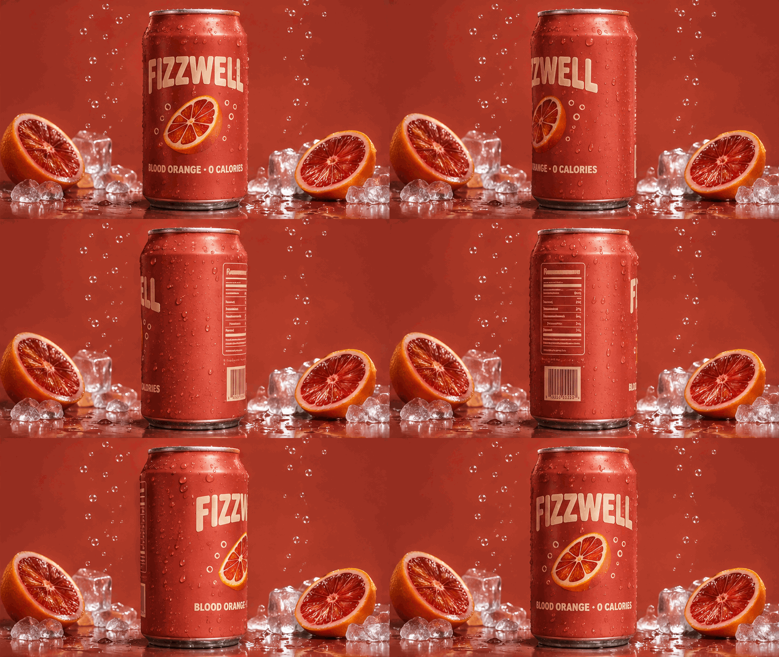
Create a single animation sprite sheet for a seamless looping GIF, 16:9 landscape overall. Subject: a slim 12 oz aluminium can of a fictional sparkling water brand called FIZZWELL, flavour Blood Orange. The can is matte deep coral with a cream FIZZWELL logo in a rounded bold sans serif, a small illustrated orange slice, and the line "BLOOD ORANGE · 0 CALORIES". It sits on a wet glossy surface against a deep coral studio backdrop, surrounded by ice and two halved blood oranges. The sequence: the can rotates slowly through one full turn on its base so the label sweeps past the camera, condensation droplets glint, small bubbles rise from the base, and frame 6 matches frame 1 so it loops. Exactly 6 sequential frames in a precise 3 column by 2 row grid, read left to right then top to bottom, identical panel sizes, fixed camera, same lighting, same props in the same positions in every frame. Commercial beverage photography, crisp highlights. No extra text, no panel numbers, no borders, no gutters.
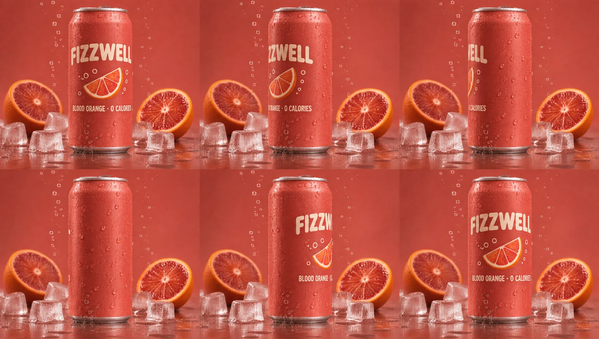
What to notice: The label wraps correctly as the can turns, and when the back comes around, the model invented a nutrition panel and a barcode on its own. It is a small touch, but it is the kind of detail that makes a product look real. The ice and the right blood orange shift slightly between frames, so look closely before you put it in a paid ad. The GIF came out at 768 by 432, which is fine for social but small for a large web banner.
Who this is for: Beverage, beauty and consumer brands that need scroll stopping motion for product pages, paid social and email headers.
Sponsored
4. One Campaign, Three Formats
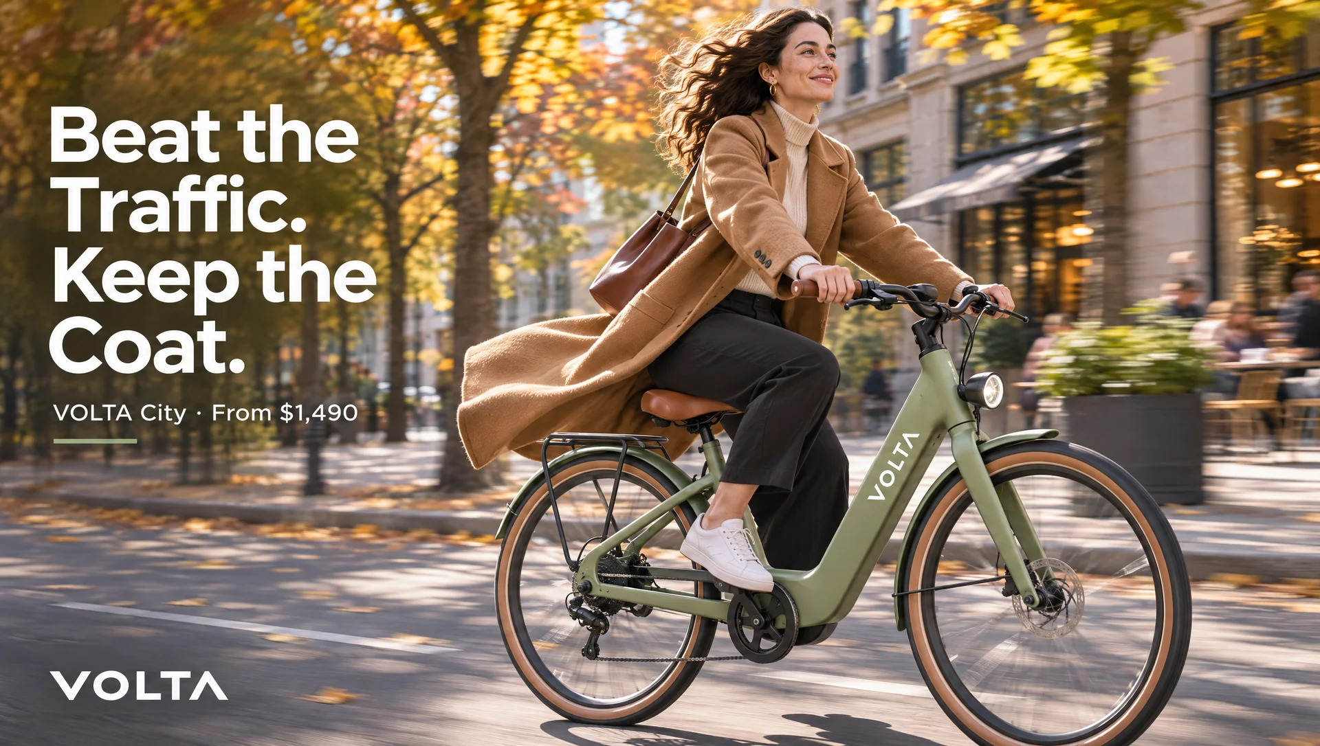
This is the test that matters most for agencies. A real campaign is never one image. It is a hero ad, then a billboard, then a story, then a banner, and the product has to look identical in all of them. We built the hero ad first, then asked the model to adapt it twice.
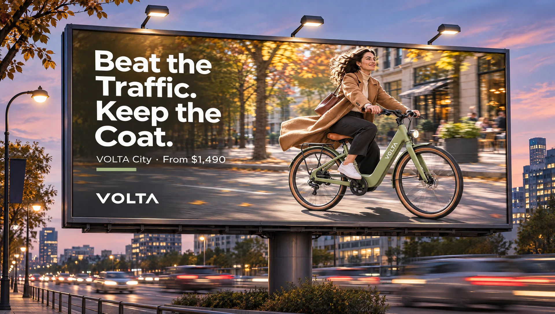
A 16:9 landscape hero advertisement for a fictional electric commuter bike brand called VOLTA. The bike: a sleek step through frame in matte sage green, tan leather saddle and grips, a slim battery integrated into the down tube, a small round front light, and the word VOLTA in white on the frame. A woman in a camel coat rides it through a sunlit tree lined city street in autumn, motion blur in the background. Left third of the frame is clean space with the headline in a bold geometric sans serif: "Beat the Traffic. Keep the Coat." and beneath it a small line "VOLTA City · From $1,490". VOLTA logo bottom left. Bright, optimistic, premium lifestyle photography.
Now adapt this exact campaign into a large roadside billboard, shown in place on a city street at dusk, 16:9 landscape. Same bike, same sage green, same rider and coat, same headline and price line, same VOLTA logo. Recompose the layout for a wide billboard: headline large on the left, the rider and bike on the right. Show the billboard frame, a few street lights, and blurred traffic below it.
Now adapt the same campaign into a vertical 9:16 Instagram story ad, shown on a phone screen held in a hand, the phone centred inside a 16:9 landscape frame with a soft neutral background either side. Same bike, colours, rider, headline and logo. Stack the layout vertically: headline at the top, bike and rider in the middle, and a "Book a test ride" button near the bottom. Keep the top and bottom of the story clear of text where the app interface sits.
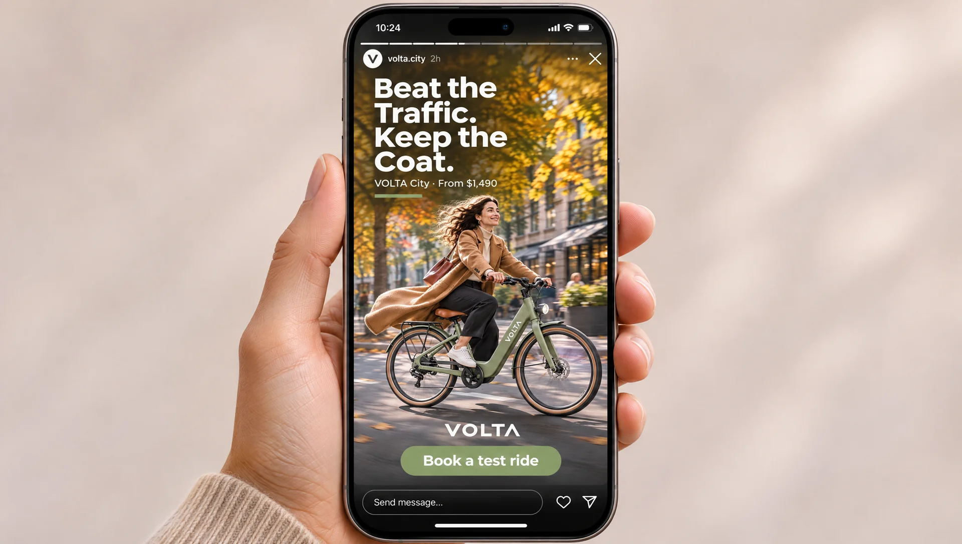
What to notice: This is the strongest example in the set. The step through frame, the sage green paint, the tan saddle and grips, the VOLTA logo on the down tube, the rider’s camel coat and bag, and the little green underline under the price all carry across three completely different layouts. The headline and price line are word for word identical every time. On the story ad, the model even built a believable Instagram interface around it, with a brand handle, a progress bar and a reply box, and kept the button clear of that box. The headline sits right under the profile row, so we would nudge it down a little for a real placement.
Who this is for: Agencies and in house teams who need to show a client how one idea lives across out of home, social and digital, early in the pitch.
5. A Black Friday Email
Emails are packed with small text: prices, codes, product names and buttons. This is where we expected the model to stumble, so we asked for a lot of it.
A 16:9 landscape image of a promotional email open in a desktop email client, shown slightly angled on a laptop screen on a wooden desk. The email is from a fictional outdoor gear brand called NORTHWIND OUTFITTERS. At the top, a header with a simple mountain logo and the brand name. Below it, a wide hero banner: a hiker in a burnt orange down jacket on a snowy ridge at sunrise, with the text overlaid "BLACK FRIDAY" in huge bold white condensed type, under it "40% OFF ALL OUTERWEAR", then "Use code SUMMIT40 · Ends Monday". A rounded orange button reading "Shop the Sale". Under the banner, a row of three product tiles: a jacket, a backpack and a pair of boots, each with a short name and a crossed out price next to a sale price. Clean, modern, on brand ecommerce design, all text crisp and correctly spelled.
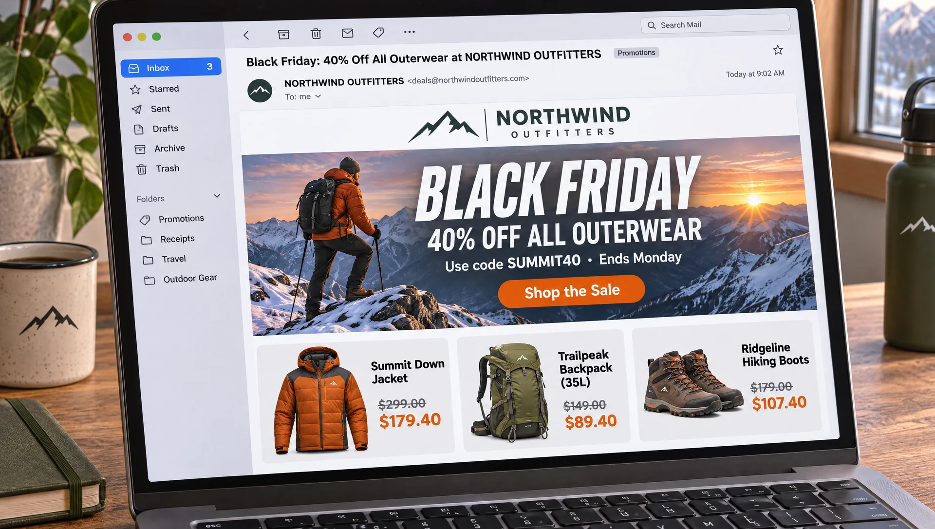
What to notice: The headline, the discount, the code SUMMIT40 and the button are all correct. The impressive part is the prices. We never gave it numbers, and it still came back with sale prices that are exactly 40 percent off: $299 to $179.40, $149 to $89.40 and $179 to $107.40. It also named the products for us and built a whole mail app around the email. The one text failure is the laptop keyboard, where the keys are gibberish. It is in the background, but crop it out before you use it.
Who this is for: Ecommerce brands mocking up a sale email to align on the offer, the layout and the copy early. Pair it with our guide to AI marketing videos if the same campaign needs a video version.
6. A UGC Style Skincare Ad
Creator style ads often outperform polished studio ads on social, because they look like a post from a real person. The trick is making it look unplanned while still keeping the product label sharp. We cover the bigger picture in our breakdown of AI UGC ads.
A 16:9 landscape photo that looks like an authentic phone shot user generated social ad. A woman in her late twenties with natural freckles and her hair in a loose claw clip, wearing an oversized white tee, stands in a bright, slightly messy real bathroom in the morning. She holds up a small frosted glass dropper bottle toward the camera, smiling mid sentence like she is talking to her followers. The bottle label is clearly readable: "LUMA SKIN", underneath "Daily Glow Serum", "Vitamin C + Niacinamide", "30 ml". Natural window light, slight phone camera grain, a toothbrush cup and towel in the background, not overly retouched, real skin texture.
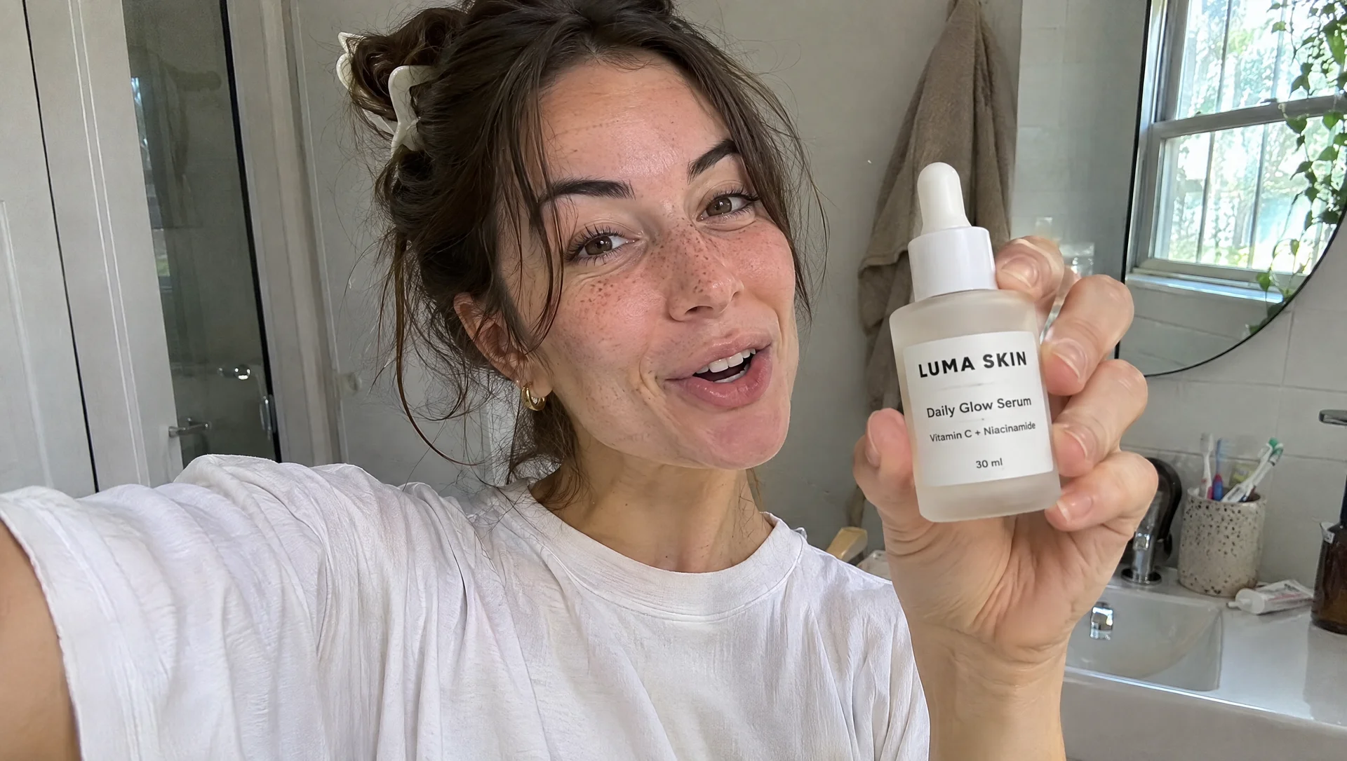
What to notice: The model chose a selfie angle with an outstretched arm, which is exactly how a real creator would film this, and it reads like a phone photo rather than an ad. The label is fully correct, down to the 30 ml, even though the bottle is held at an angle in a hand. Freckles, the claw clip, the towel and the toothbrush cup are all there. If you use this approach for real ads, label it as AI generated and do not present a made up person as a real customer.
Who this is for: Beauty and wellness brands testing ad angles and hooks before paying creators to film the winners.
Sponsored
7. A Restaurant Special Menu Board
Small businesses need this kind of thing every single week. A chalkboard menu tests hand lettering, price alignment and a lot of short lines of text.
A 16:9 landscape photo of a chalkboard style menu board mounted on a warm brick wall inside a busy, cosy taqueria in Los Angeles, with string lights and a blurred counter in the foreground. The board is for a fictional restaurant called TAQUERIA SOL, with a hand lettered sun logo at the top. Headline: "TACO TUESDAY". Underneath, a neat list in hand lettered chalk with prices aligned on the right: "Al Pastor ..... $3", "Carne Asada ..... $3.50", "Baja Fish ..... $4", "Mushroom Birria ..... $3.50", "Horchata ..... $2.50". At the bottom: "2 for 1 margaritas, 4 to 7 PM". Small chalk drawings of a lime and a chilli in the corners. Realistic chalk texture, everything legible and correctly spelled.
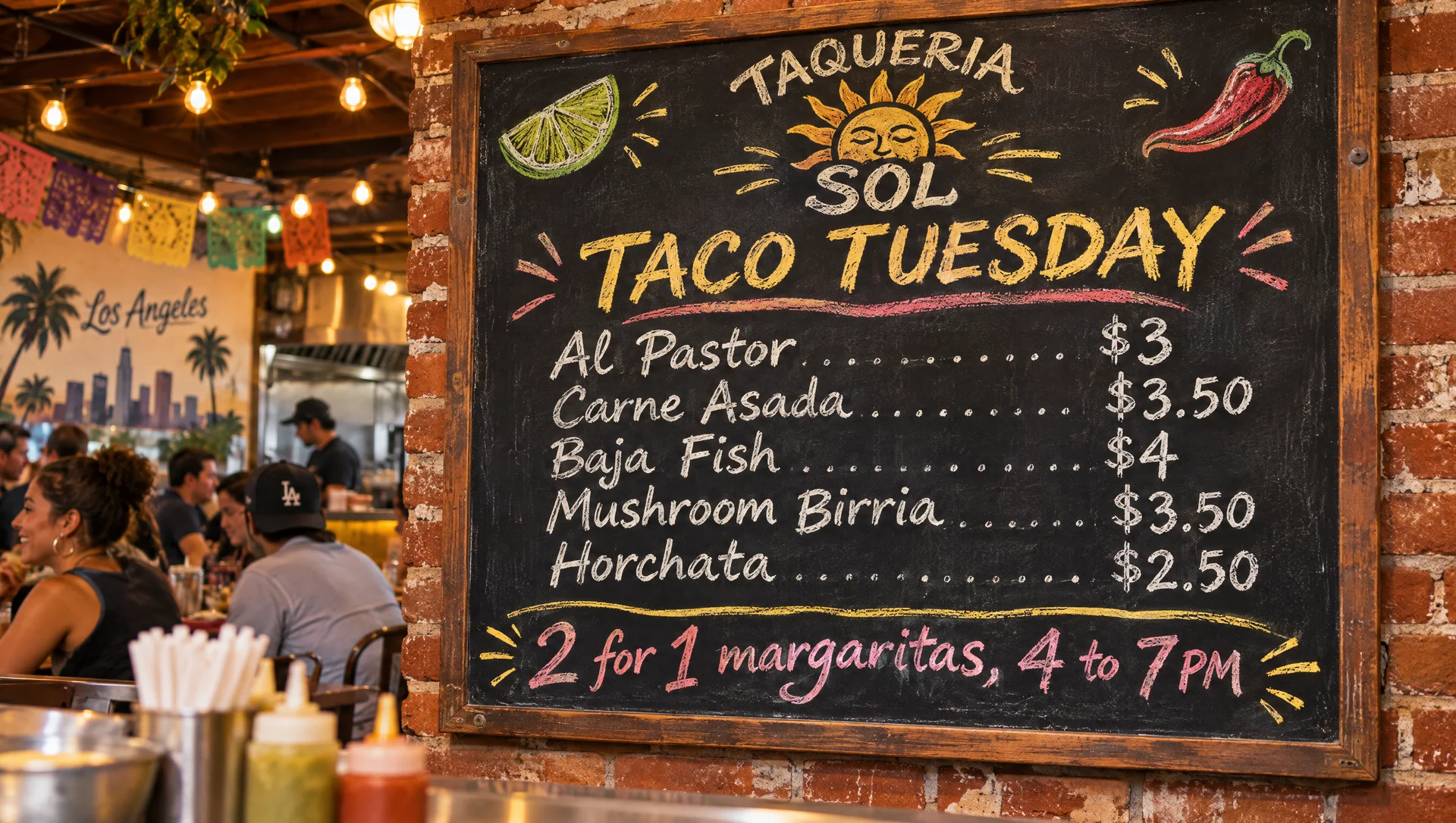
What to notice: All five items and prices are correct, and the prices line up neatly on the right with dotted leaders. The chalk lettering stays consistent from the first line to the last. The model added papel picado banners and a Los Angeles mural in the background, which fit the setting but were not in the brief. A restaurant owner could post this tonight.
Who this is for: Restaurants, bars and cafes that need a weekly special for Instagram, Google Business posts or a printed table card.
8. An A/B Test Headline Grid
Good ad testing changes one thing at a time. If the photo changes along with the headline, you never know which one made the difference. So we asked for four versions of the same ad where only the words change.
A 16:9 landscape grid of four versions of the same social media ad, two columns by two rows, thin white gutters, on a light grey background. Every version uses the identical photograph: a pair of fictional KESTREL running shoes in electric blue and white, mid stride on a wet city road at dawn, splashes frozen in the air. The KESTREL wordmark sits in the same bottom right position on all four. Only the headline changes, set in the same bold italic sans serif, top left of each panel. Panel 1: "Run Before the City Wakes." Panel 2: "Your Fastest 5K Starts Here." Panel 3: "Lighter Than Your Excuses." Panel 4: "Rain Is Just Extra Cooling." Small label under each panel: "A", "B", "C", "D". Everything identical between panels except the headline.
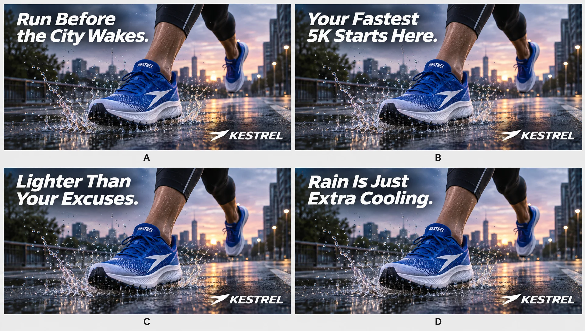
What to notice: The four panels use the same photograph, splashes and all, and the KESTREL logo sits in exactly the same spot. Only the headline changes, and all four are spelled correctly. That makes this a clean test, not four different ads. In practice you would cut the grid into four separate images and upload them as variants.
Who this is for: Performance marketers and small brands running Meta or TikTok ads who want clean copy tests for every campaign.
9. Editing One Detail of a Product Photo
The everyday request from a client is not a new image, it is a small change to the one they already love. A different color, a new strap, a swapped product. We shot a watch flat lay, then asked for one change only.
A 16:9 landscape overhead flat lay product photo for a fictional watch brand called HALDEN. Centre: a minimalist 38mm watch with a brushed steel case, cream dial, slim black hands and a black leather strap. Around it, neatly arranged on a dark slate surface: a folded navy linen pocket square, a fountain pen, a small open notebook, and a matte black gift box with HALDEN in gold on the lid. Soft directional window light from the left, premium catalogue photography, shallow shadows.
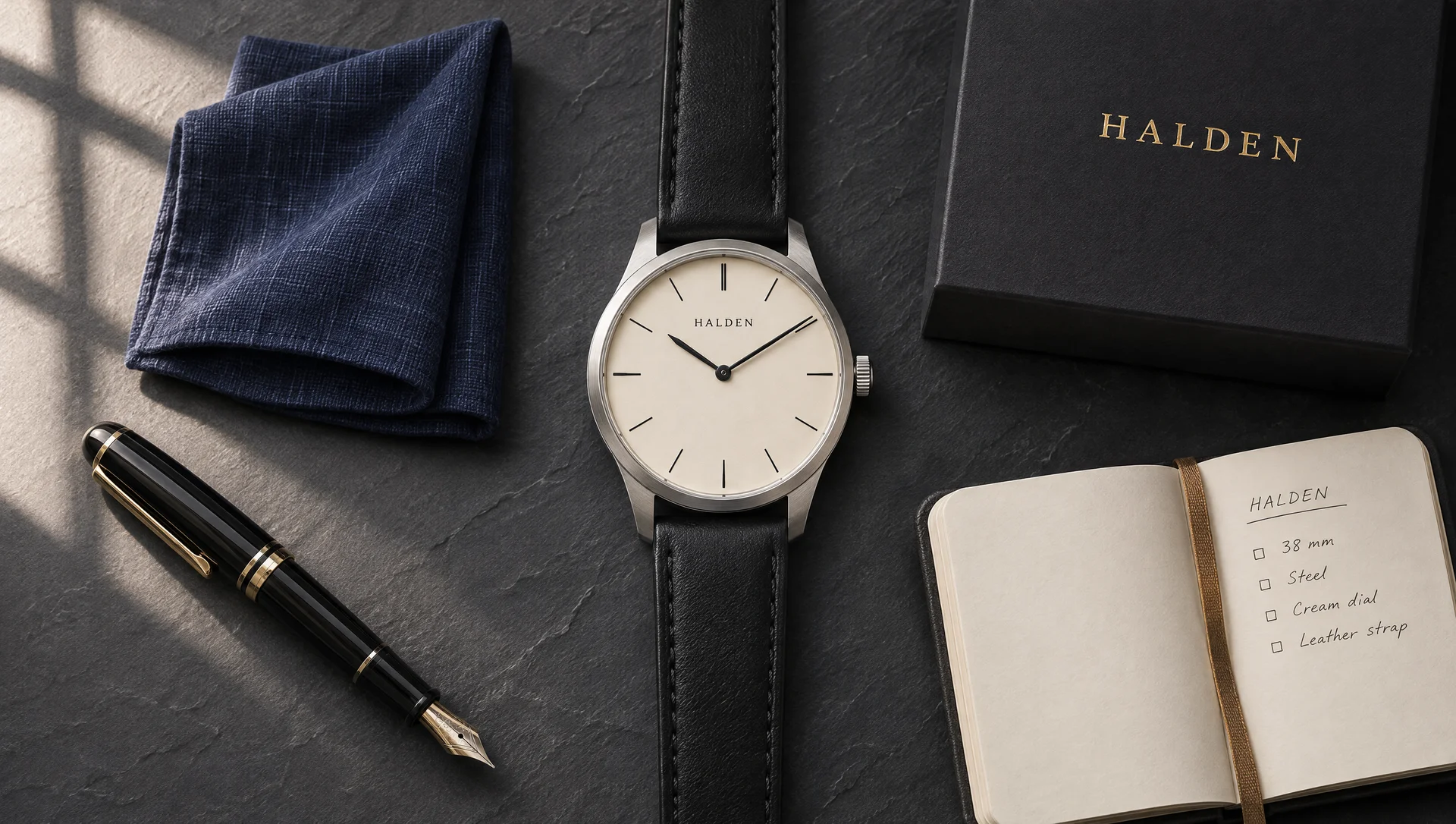
For step 2 we opened the image in ChatGPT and used the markup tool. You click the image, pick the brush, and paint over the part you want changed. We painted over the strap in red, top and bottom, and left the watch face, the props and the background alone. Then we typed one short instruction.
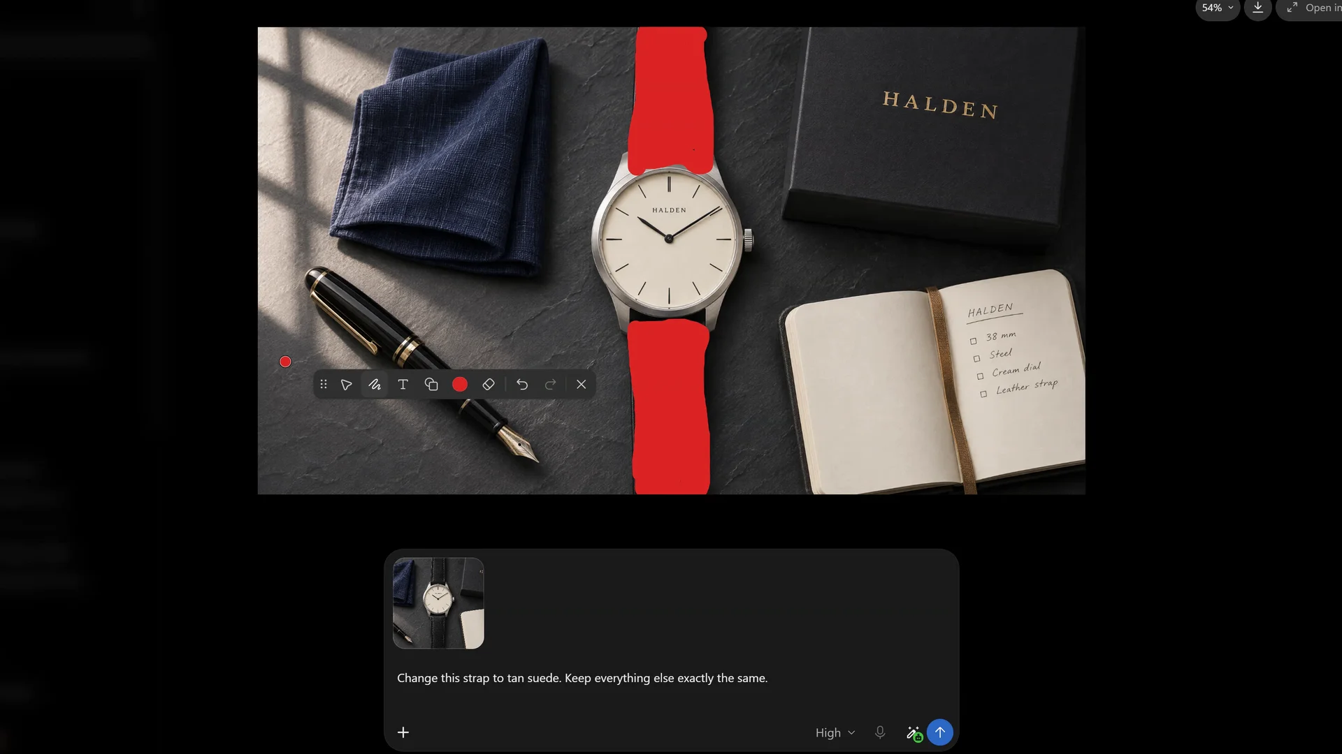
Change this strap to tan suede. Keep everything else exactly the same.
About 40 seconds later, here is what came back.
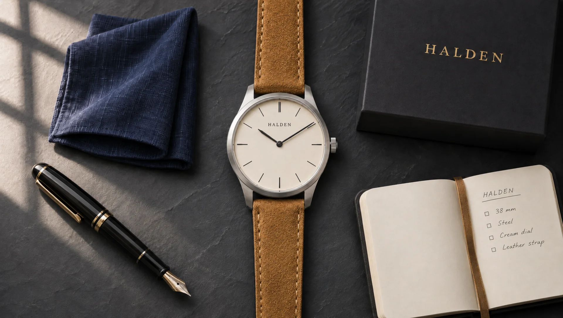
What to notice: The strap is now tan suede, with a soft brushed nap and stitching that follows the edges, and it still fits the lugs of the watch. The case, the dial, the pen, the pocket square, the box, the notebook and the window shadows all stayed where they were. The markup did the hard part: our instruction only says “this strap”, and the red brush told the model which strap we meant. When we compared the before and after files pixel by pixel, the whole image had been redrawn with tiny texture differences, so the edit is visually locked rather than pixel locked. For social that does not matter. For regulated packaging, check it. And the notebook still reads leather strap, because we told the model to keep everything else exactly the same, and it listened.
You can also do this with a typed instruction alone, by naming the strap and listing everything that should stay the same. It works, but markup is faster and leaves less room for the model to guess.
Who this is for: Ecommerce and product brands that need colorway and variant images for every SKU.
Sponsored
10. A Brand Identity Board
Last, a full agency deliverable: a logo, an icon, a color palette with hex codes, type choices, and the brand applied to real products. This tests whether the model can keep one logo consistent across several mockups in a single image.
A 16:9 landscape brand identity presentation board for a fictional premium pet food startup called KINDRED PET CO. Clean layout on an off white background with a grid of sections. Top left: the primary logo, a simple line drawing of a dog and cat forming a heart, with KINDRED PET CO. in a friendly rounded serif. Next to it, a smaller icon only version. A colour palette row of five swatches with labels: "Oat #EFE6D8", "Fern #4F6B4A", "Clay #C2714F", "Ink #1F2A2E", "Butter #F2C46D". A typography section showing the headline font and body font with sample text "Real food for the ones who wait at the door." Bottom half: three application mockups using the brand, a kraft paper food bag, a delivery box, and an Instagram post. Consistent, cohesive, professional agency style.
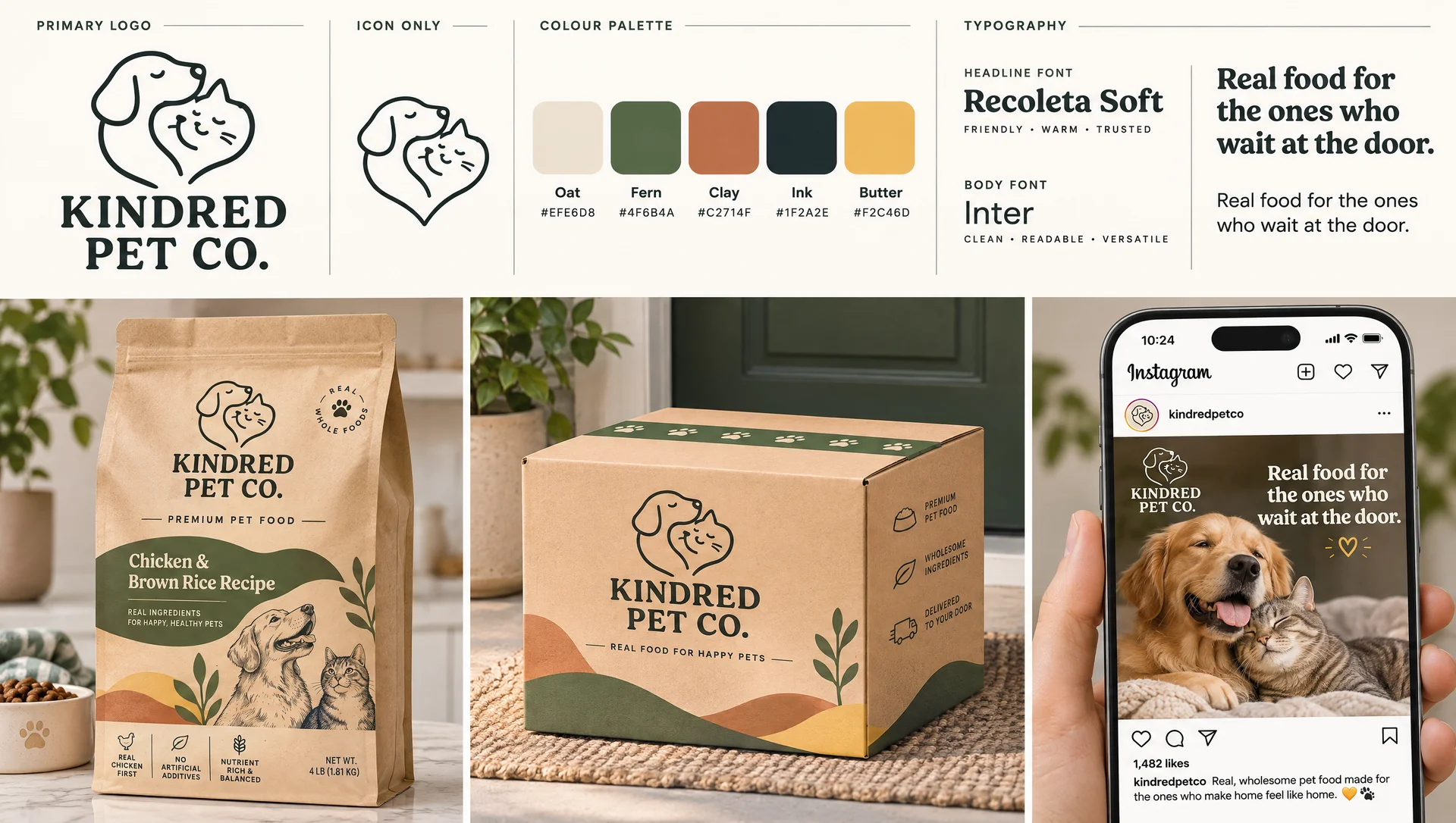
What to notice: All five hex codes are written exactly as asked, and the dog and cat heart logo is the same drawing on the bag, the box and the Instagram post. The model wrote its own tagline for the bag and box and a caption for the post. It also named real typefaces for the type section. If you take a board like this further, check the font licenses, and treat the whole thing as a direction for a designer to refine, not a finished logo you can trademark.
Who this is for: Founders and small agencies pitching a brand direction. If you need assets to build it out, Envato Elements has licensed fonts and product mockups.
All 10 GPT Image 2.6 Examples at a Glance
| Example | Format | Best for | Result |
|---|---|---|---|
| 1. Luxury print ad | Still, magazine spread | Hotels, travel, print | All copy correct |
| 2. Brand mascot | Animated GIF + sprite sheet | Social, stickers, web | Clean loop, slight drift |
| 3. Product loop | Animated GIF + sprite sheet | Product pages, paid social | Label wraps, props jitter |
| 4. Campaign in three formats | Hero, billboard, story | Agencies, campaign pitches | Strongest consistency |
| 5. Black Friday email | Email mockup | Ecommerce | Correct 40% prices |
| 6. UGC skincare ad | Phone style photo | Beauty, wellness | Real looking, label sharp |
| 7. Menu board | Chalkboard photo | Restaurants | Prices aligned |
| 8. A/B headline grid | Four ad variants | Performance marketing | Identical photo |
| 9. Product detail edit | Flat lay, two steps | Ecommerce variants | Only the strap changed |
| 10. Brand identity board | Presentation board | Founders, agencies | Hex codes exact |
Swipe sideways to see the full table →
Where GPT Image 2.6 Still Slips
None of these misses would stop us from using the model, but you should know about them before a client does.
- It adds things. Pergolas, murals, taglines, product names, a notebook checklist. Great for mockups, risky when legal has approved every word of the copy.
- GIFs are small. Ours came out at 768 by 432. Fine for social, soft on a big website banner.
- Motion is close, not locked. The mascot drifts during its hop, and the ice and fruit shift a little as the can spins.
- Background text can still break. The laptop keyboard in the email shot is nonsense. The text you ask for is reliable, the text it invents in the background is not.
- Edits redraw the whole image. They look identical, but they are not pixel perfect. Check anything that needs to match a printed spec.
On the trust side, the GIFs we downloaded carry C2PA content credentials, the industry standard tag that marks an image as AI generated. OpenAI covers the rest of its safeguards in the Images 2.6 system card.
Why GPT Image 2.6 Matters for Marketers
Here is our take. Image quality stopped being the story a while ago. The last few models could all make a beautiful picture. What 2.6 improves is the boring stuff that eats a marketing team’s week: keeping the product the same across five formats, getting the prices right, making a small edit without breaking the rest, and giving you motion without opening a video editor.
That changes where the effort goes. The hard part of this article was writing the briefs: knowing that an A/B test needs one variable, that a story ad needs safe zones, that a UGC ad should look unplanned. The model does what you ask. Knowing what to ask is still the job. If you want to see how this fits into a bigger strategy, read our take on generative AI advertising, or compare tools in our best AI image generator guide.
What We Actually Use at JZ Creates
We run JZ Creates, a creative agency in Los Angeles focused on AI and automation for brands. For pay as you go access to image and video models without a monthly plan, we like Kie.ai. Licensed fonts, mockups and stock come from Envato Elements. Once the ads are made, we schedule them across platforms with Blotato, and the briefs, prompt libraries and client approvals all live in Google Workspace, so the whole team works from the same files.
If you want this whole pipeline built for your brand, from the prompts to the posting, that is what our AI creative services are for.
The Bottom Line
These GPT Image 2.6 examples show a model that is finally ready for everyday marketing work: campaigns that stay consistent, small print that holds up, and GIFs that bring a brand to life in seconds. If you need help turning AI image and ad creative into real campaigns for your brand, that is exactly what our team does. At JZ Creates, we produce captivating, engaging content for social and digital, from AI ads and commercials to 3D and full creative production. Browse more breakdowns on our blog, or contact us today and let’s build your next campaign together.
Frequently Asked Questions
What is GPT Image 2.6?
GPT Image 2.6 is OpenAI’s image model released on November 4, 2026 as Images 2.6. It generates images about 50 percent faster than the previous version, creates animated GIFs, and keeps characters, products and brand details more consistent across edits. It is available in ChatGPT and Codex on all plans and in the API as GPT Image 2.6 Flare and Sunburst.
Can GPT Image 2.6 make ads?
Yes. Our GPT Image 2.6 examples above include a magazine ad, a billboard, an Instagram story ad, a Black Friday email, a UGC style ad and a menu board, all with readable, correctly spelled copy. Treat the results as strong mockups and first drafts, and have a person check every word and price before anything runs.
How do you make a GIF with GPT Image 2.6?
Describe the motion you want, say it should be a seamless looping animated GIF, and ask for the last frame to match the first. Keep the camera fixed and the character or product in the same position, and describe the motion step by step. You can also ask for a sprite sheet of six frames in a grid if you want to animate the frames yourself.
How much does GPT Image 2.6 cost?
OpenAI says Images 2.6 is available across all ChatGPT subscription tiers, with usage limits that depend on your plan. In the API, it is billed by tokens at $8 per million image input tokens and $30 per million image output tokens, the same as GPT Image 2.5.
What is the difference between Flare and Sunburst?
They are the two API versions of GPT Image 2.6. Flare is built for speed and can return an image in about six seconds on low quality. Sunburst is the higher quality option and keeps images more consistent across edits on medium or high quality. In ChatGPT there is no switch, you just ask for an image.

About Jay Hernandez
Jay Hernandez is an award-winning Creative Director with 20+ years of driving standout campaigns for top brands. Based in Los Angeles, he blends deep creative expertise with cutting-edge AI tools to help businesses and marketing teams unlock bold, breakthrough ideas that deliver real impact. If you are ready to elevate your brand and turn big visions into unforgettable campaigns, connect with Jay and make it happen.
Share This Article
Sponsored